$ cat article.md
Crafting a simple Figma plugin with AI
Crafting a simple Figma plugin with AI
Crafting a simple Figma plugin with AI
How I leveraged Antigravity to build a custom Figma tool and scale our design operations.
How I leveraged Antigravity to build a custom Figma tool and scale our design operations.
4 min read
AI, Design Ops, Figma

⚡ Project at a glance
The problem: Creating pages by hand was a repetitive chore that made file organization slow and inconsistent.
The solution: A custom Figma plugin that standardizes page creation and grouping.
Tools used: Antigravity (powered by Gemini 3.1 Pro), Figma MCP.
Link: Pager on Figma Community
Why we needed a better workflow
As a Design Manager, my job is making sure our design operations scale. We aim to get the first version right, ship quickly, and refine with real user feedback.
I've been designing in Bangladesh for 8 years, and moving fast needs a solid foundation. With a team, clean and well organized files are an operational necessity. Anyone should be able to open a file, understand it instantly, and trace a design back to its Jira ticket.
The challenge: The repetitive trap
We already had a system for naming and organizing pages, but doing it by hand was repetitive, and it was starting to piss me off. The page plugins on Figma Community didn't fit my workflow. I wanted something simple, flexible for a team, and free of login walls.
In the era of AI, why not build something that fits my exact process?
Why Figma still wins for UX

Mapping out every interaction, edge case, and component before letting the AI write a single line of code.
Before writing a single prompt, I designed the entire flow in Figma. Designing the interface with AI tools meant endless back-and-forth and crazy usage limits, even in Claude's new design tool.
Getting the UX right in Figma first gave the AI a clear blueprint to follow, instead of guessing what the experience should be.
Claude vs. Antigravity
I started with Claude Code in VS Code, but kept hitting usage limits, and waiting for resets broke my momentum.
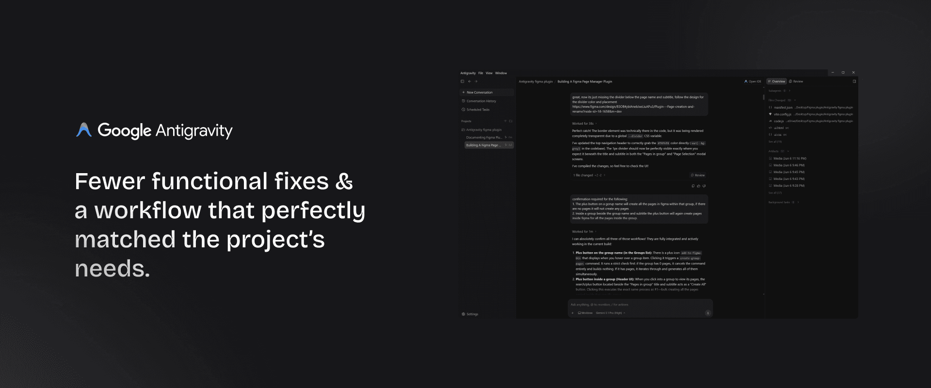
So I made it a race, building the plugin in both Google Antigravity (with Gemini 3.1 Pro) and Claude Code. Antigravity gave me more consistent results, and for this project it was the right fit.
Triumphs and hurdles
The plugin is simple under the hood, but the UX relies on many interaction-dependent features. Antigravity handled them well, and I needed fewer functional fixes after each prompt.
The hardest part was the Figma MCP. Antigravity couldn't see all our color tokens unless I switched Figma's dev mode from light to dark to expose them. IDEs like Cursor and VS Code pull these in directly, but Antigravity isn't there yet.
The core logic was solid. Most of my time went into UI details like the scroll bar, line heights for wrapped text, and hover colors. Features like dragging groups and renaming pages on double-click worked exactly as intended.
The crucial role of constant QA
If there's one lesson I learned, it's that extensive QA is the secret to building well with AI. AI writes code fast, but you have to verify it constantly so small bugs don't snowball.
I tested and cleaned up one flow completely before moving to the next, and ran the plugin locally in a browser before importing it into Figma. Inside Figma, new issues still appeared:
The manifest error: Importing the manifest.json failed right away.
Functional breakdowns: Groups broke inside Figma. I could create them but couldn't enter them or add pages, and drag-and-drop stopped working.
UI state regressions: Adding an info button to the top navigation broke the dark mode toggle and the compress icon.
Styling inconsistencies: Fonts didn't match Figma's native UI, bullet colors were off, and dividers were missing.
That's why regression testing matters. After every new flow, I rechecked the old ones, because new generated code often breaks working features. It takes time, but it saves you from starting over.
Designing for designers

The audience was my own design team, so UX decisions were easier. I used established patterns that need no explanation and kept the feature set simple and scalable.
What I would do differently
If I started another project tomorrow, I would prepare better:
Map out the full user flow: A complete user flow before the first prompt prevents structural rewrites later.
Write a dense instruction manual: Document exactly what every feature does, step by step. Richer context means less back-and-forth, fewer misunderstandings, and fewer tokens.
Key takeaways for building with AI
If you have an idea for a tool, you can build it.
Don't let tooling slow you down: If you hit limits, switch tools or run them side by side.
Prepare your context: The better your flows and documentation, the better the AI performs.
Focus on the UI, trust the logic: AI writes solid functional JavaScript. Spend your energy on UI, typography, and edge cases.
Try it out
The plugin is live and public on the Figma Community. Try Pager
Building what I needed from instinct, rather than fighting syntax, was an incredible experience. If you build your own tool, I'd love to hear about it.
⚡ Project at a glance
The problem: Creating pages by hand was a repetitive chore that made file organization slow and inconsistent.
The solution: A custom Figma plugin that standardizes page creation and grouping.
Tools used: Antigravity (powered by Gemini 3.1 Pro), Figma MCP.
Link: Pager on Figma Community
Why we needed a better workflow
As a Design Manager, my job is making sure our design operations scale. We aim to get the first version right, ship quickly, and refine with real user feedback.
I've been designing in Bangladesh for 8 years, and moving fast needs a solid foundation. With a team, clean and well organized files are an operational necessity. Anyone should be able to open a file, understand it instantly, and trace a design back to its Jira ticket.
The challenge: The repetitive trap
We already had a system for naming and organizing pages, but doing it by hand was repetitive, and it was starting to piss me off. The page plugins on Figma Community didn't fit my workflow. I wanted something simple, flexible for a team, and free of login walls.
In the era of AI, why not build something that fits my exact process?
Why Figma still wins for UX
Mapping out every interaction, edge case, and component before letting the AI write a single line of code.
Before writing a single prompt, I designed the entire flow in Figma. Designing the interface with AI tools meant endless back-and-forth and crazy usage limits, even in Claude's new design tool.
Getting the UX right in Figma first gave the AI a clear blueprint to follow, instead of guessing what the experience should be.
Claude vs. Antigravity
I started with Claude Code in VS Code, but kept hitting usage limits, and waiting for resets broke my momentum.
So I made it a race, building the plugin in both Google Antigravity (with Gemini 3.1 Pro) and Claude Code. Antigravity gave me more consistent results, and for this project it was the right fit.
Triumphs and hurdles
The plugin is simple under the hood, but the UX relies on many interaction-dependent features. Antigravity handled them well, and I needed fewer functional fixes after each prompt.
The hardest part was the Figma MCP. Antigravity couldn't see all our color tokens unless I switched Figma's dev mode from light to dark to expose them. IDEs like Cursor and VS Code pull these in directly, but Antigravity isn't there yet.
The core logic was solid. Most of my time went into UI details like the scroll bar, line heights for wrapped text, and hover colors. Features like dragging groups and renaming pages on double-click worked exactly as intended.
The crucial role of constant QA
If there's one lesson I learned, it's that extensive QA is the secret to building well with AI. AI writes code fast, but you have to verify it constantly so small bugs don't snowball.
I tested and cleaned up one flow completely before moving to the next, and ran the plugin locally in a browser before importing it into Figma. Inside Figma, new issues still appeared:
The manifest error: Importing the manifest.json failed right away.
Functional breakdowns: Groups broke inside Figma. I could create them but couldn't enter them or add pages, and drag-and-drop stopped working.
UI state regressions: Adding an info button to the top navigation broke the dark mode toggle and the compress icon.
Styling inconsistencies: Fonts didn't match Figma's native UI, bullet colors were off, and dividers were missing.
That's why regression testing matters. After every new flow, I rechecked the old ones, because new generated code often breaks working features. It takes time, but it saves you from starting over.
Designing for designers
The audience was my own design team, so UX decisions were easier. I used established patterns that need no explanation and kept the feature set simple and scalable.
What I would do differently
If I started another project tomorrow, I would prepare better:
Map out the full user flow: A complete user flow before the first prompt prevents structural rewrites later.
Write a dense instruction manual: Document exactly what every feature does, step by step. Richer context means less back-and-forth, fewer misunderstandings, and fewer tokens.
Key takeaways for building with AI
If you have an idea for a tool, you can build it.
Don't let tooling slow you down: If you hit limits, switch tools or run them side by side.
Prepare your context: The better your flows and documentation, the better the AI performs.
Focus on the UI, trust the logic: AI writes solid functional JavaScript. Spend your energy on UI, typography, and edge cases.
Try it out
The plugin is live and public on the Figma Community. Try Pager
Building what I needed from instinct, rather than fighting syntax, was an incredible experience. If you build your own tool, I'd love to hear about it.
© 2026 Farhad
Elsewhere
LinkedIn ↗
Instagram ↗
X ↗
Index
Case studies
Impact
How I work
Writing
References
© 2026 Farhad
© 2026 Farhad