$ cat article.md
Designing KYC for people who don't trust apps
Designing KYC for people who don't trust apps
Designing KYC for people who don't trust apps
How a simple upload loop turned a slow, error-prone KYC process into something business owners could actually finish.
How a simple upload loop turned a slow, error-prone KYC process into something business owners could actually finish.
6 min read
Fintech, UX, Design Leadership

⚡ Project at a glance
The problem: Loan applicants had to submit at least 8 types of documents for KYC. Most dropped off, sent the wrong ones, or sent blurry photos.
The solution: A document loop that only asks for what's relevant, explains every document, and gives feedback after every upload.
Scope: 3 apps (applicant, field agent, field verification), designed in about 10 working days.
Legacy: Now the standard document flow across ShopUp's products.
Role: Design lead for the product, working with the product head, field agents and operations.
Where it started: envelopes and scanners
In 2018, ShopUp partnered with lenders to offer digital credit, business loans for small to large retailers, online and offline.
Bangladesh's regulations require a lot of documents for KYC. They prove who the applicant is, whether the business is real, and how much they can borrow.
At first we did it all on paper. We sent applicants a document checklist and a KYC form. They filled it in, added the documents, sealed the envelope and posted it back. We scanned everything, digitized it, then started the review.
It was slow, tedious, and errors crept in every time we digitized.
The first app
Next we moved to an app. Back then nothing like it existed in Bangladesh, and for our users it was completely new. Most business owners preferred doing things in person and didn't trust digital processes. Taking clear photos of documents also needed a decent phone and some technical confidence.
The MVP was simple. Register with your name and phone number, then see one long list of every document. We deliberately let people submit whatever they had, so they'd build the habit of uploading.
It didn't work for most people. They uploaded 2 or 3 documents, scrolled, saw a long list, got anxious and hit the sticky send button. Some called support to ask what the documents were. Some didn't have them. Some were asked for documents that didn't even apply to their loan.

Caption: One long list, and a send button that was always there.
For a year that was fine. Volume was low, and support and field agents filled the gaps.
When volume hit
As the product grew, I was put in charge of it. Until then my design lead and I had shared the work, and as the company grew we split products between us.
ShopUp itself was growing fast. In late 2018 it worked with about 28,000 small businesses. By 2020 that number was 655,000.
Then, like any startup, the numbers had to jump. We went from 3 to 4 KYC applications a day to 30 to 40. Every application had at least 8 types of documents, plus verification and approval.
That's when the bottleneck hit. We needed something that worked, and we needed it within a week. It was my first time leading a product.
The flow that failed
My brain started throwing out ideas, too many and too fast. When you're stuck between a rock and a hard place, you try to squeeze out any way you can. That's the worst thing to do.
I did it anyway. I launched a flow, and it failed.
The next month we went again, and the scope grew to 3 apps:
Applicant app: for the business owner applying for the loan
Field agent app: for collecting and checking documents
Field verification app: for visiting the business and confirming it's real, at the right address, with the right person behind it
Field verification mattered because documents can be forged easily, and apart from things like the NID number and some bank credit details, we had no way to check them digitally.
Stepping back
So I stopped. No meetings for a couple of days. I asked myself what I would design, not what everyone wanted me to design.
There were no local references for a flow like this, so I went straight to the people living it. I spoke in depth with field agents and with applicants who had received loans, asking how long it took and how the process felt.
Here's what we heard:
Too many documents made people anxious
People didn't know when the flow would end
People were asked for documents they didn't need
People didn't know what some documents meant
Photos were blurry, so support had to call them to upload again
Field agents had to visit to collect missing documents, which became another scheduling problem
Field agents couldn't find business locations to verify
Processing time grew, so verification and disbursement slowed down
Fraud started to appear because teams couldn't see each other's work
I sat with the product head, laid the problems on top of each other, and we agreed we needed something built for our users. Then the clock started: a new idea, approval, and design for 3 apps in about 10 working days.
After two days of research and notes, my head was full. I took a long nap, a whole day really. I woke up with a fresh mind and one rule: solve the problems, nothing else.
Turning problems into decisions
Too many documents, and the wrong ones: show only the documents relevant to the loan the applicant chose.
No sense of an ending: a loop that always returns to the list, with clear feedback on what's done.
Unclear documents: explain why we need each one. Transparency builds trust.
Blurry photos: show a simple guide on how to take the photo, and say clearly that a bad photo will delay the loan.
Missing documents: no submitting until every required document is uploaded. Field agents only visit for signatures after the uploads are verified.
Hard-to-find locations: geotag the business photo, and tell the applicant we're using their location for verification.
Fraud: live photos and early facial recognition, on top of our 3 layers of verification and the lender's own checks. Anyone who gets through all of that is very good, and that's a risk you accept and know about.
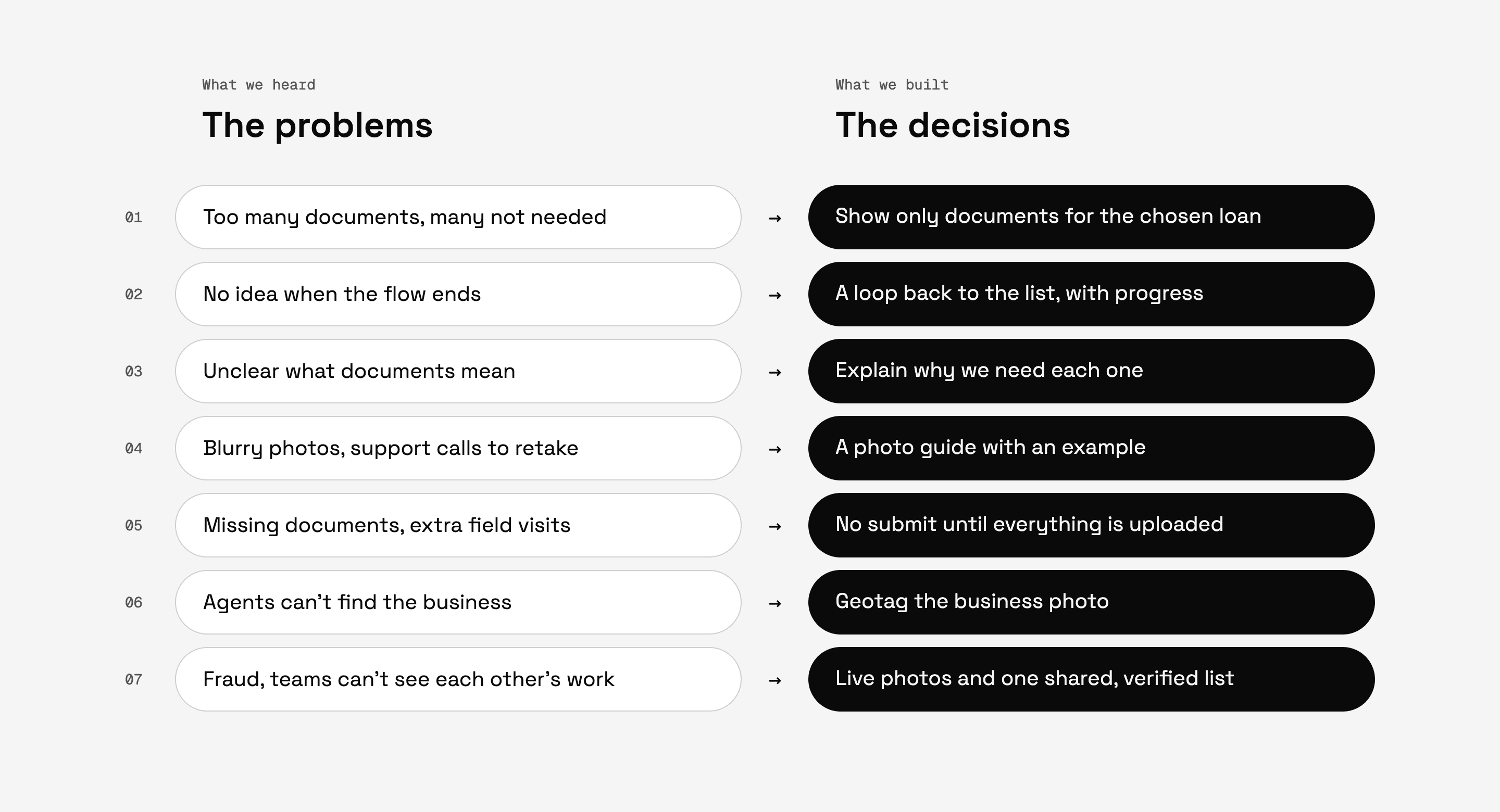
Caption: Every decision traced back to a problem we heard in the field.
The loop
The applicant enters the loan amount, business type and estimated sales.
We show eligible loan products and amounts. They pick one.
The upload page shows a progress bar at the top, then document categories.
They open a category, then a document.
They see why we need it, how to photograph it, and an example of what it looks like.
They take a photo or upload from storage, preview it, and confirm.
They're back in the category, ready for the next document, in any order.

Caption: Every upload loops back to the list, so you always know where you are.
The whole system works like traffic lights:
Orange: not uploaded yet
Green: uploaded
Red: rejected, with a note explaining why, so they can upload again

Caption: Orange to do, green done, red to fix.
The interactions matter as much as the screens. Upload the last document in a category and confirm, and you skip the category page and land back on the main list, with that category now green. Partial progress shows too, like 2 of 4 in a category. You get feedback after every single upload.
And there's no send button until everything required is done. It only appears at the very end.
Three apps, one pattern
Once the applicant app worked, the other two followed quickly. The field agent and verification apps used the same pattern in different states. Agents saw the same approved document list, so they could match it against what they found on the ground.

Caption: One pattern, three apps, three different jobs.
What changed
Support calls dropped significantly
Applicants knew exactly what was left and when they were done
Fraud attempts stalled halfway, because without every required upload there was simply no send button
Field teams worked from the same verified list, so everyone saw the same truth
The loop became ShopUp's standard document flow, now used across every product that collects documents
What I learned
Don't squeeze out a solution under pressure. My first launch failed because I rushed. Stepping back cost two days and saved months.
Design what the problem needs, not what the room wants. The best inputs came from field agents and applicants, not meetings.
Feedback is a feature. People finish what they can see progress on.
Constraints can do the work. Hiding the send button fixed incomplete uploads and slowed fraud at the same time.
Further reading
Bangladesh's ShopUp shows the possibilities for frontier fintech · Euromoney
Bangladeshi retail tech startup raises $74m from US fund · Nikkei Asia
Bangladeshi lendtech ShopUp receives $1.62m investment · FinTech Futures
ShopUp's journey to the largest Series A in Bangladesh · The Financial Express
⚡ Project at a glance
The problem: Loan applicants had to submit at least 8 types of documents for KYC. Most dropped off, sent the wrong ones, or sent blurry photos.
The solution: A document loop that only asks for what's relevant, explains every document, and gives feedback after every upload.
Scope: 3 apps (applicant, field agent, field verification), designed in about 10 working days.
Legacy: Now the standard document flow across ShopUp's products.
Role: Design lead for the product, working with the product head, field agents and operations.
Where it started: envelopes and scanners
In 2018, ShopUp partnered with lenders to offer digital credit, business loans for small to large retailers, online and offline.
Bangladesh's regulations require a lot of documents for KYC. They prove who the applicant is, whether the business is real, and how much they can borrow.
At first we did it all on paper. We sent applicants a document checklist and a KYC form. They filled it in, added the documents, sealed the envelope and posted it back. We scanned everything, digitized it, then started the review.
It was slow, tedious, and errors crept in every time we digitized.
The first app
Next we moved to an app. Back then nothing like it existed in Bangladesh, and for our users it was completely new. Most business owners preferred doing things in person and didn't trust digital processes. Taking clear photos of documents also needed a decent phone and some technical confidence.
The MVP was simple. Register with your name and phone number, then see one long list of every document. We deliberately let people submit whatever they had, so they'd build the habit of uploading.
It didn't work for most people. They uploaded 2 or 3 documents, scrolled, saw a long list, got anxious and hit the sticky send button. Some called support to ask what the documents were. Some didn't have them. Some were asked for documents that didn't even apply to their loan.
Caption: One long list, and a send button that was always there.
For a year that was fine. Volume was low, and support and field agents filled the gaps.
When volume hit
As the product grew, I was put in charge of it. Until then my design lead and I had shared the work, and as the company grew we split products between us.
ShopUp itself was growing fast. In late 2018 it worked with about 28,000 small businesses. By 2020 that number was 655,000.
Then, like any startup, the numbers had to jump. We went from 3 to 4 KYC applications a day to 30 to 40. Every application had at least 8 types of documents, plus verification and approval.
That's when the bottleneck hit. We needed something that worked, and we needed it within a week. It was my first time leading a product.
The flow that failed
My brain started throwing out ideas, too many and too fast. When you're stuck between a rock and a hard place, you try to squeeze out any way you can. That's the worst thing to do.
I did it anyway. I launched a flow, and it failed.
The next month we went again, and the scope grew to 3 apps:
Applicant app: for the business owner applying for the loan
Field agent app: for collecting and checking documents
Field verification app: for visiting the business and confirming it's real, at the right address, with the right person behind it
Field verification mattered because documents can be forged easily, and apart from things like the NID number and some bank credit details, we had no way to check them digitally.
Stepping back
So I stopped. No meetings for a couple of days. I asked myself what I would design, not what everyone wanted me to design.
There were no local references for a flow like this, so I went straight to the people living it. I spoke in depth with field agents and with applicants who had received loans, asking how long it took and how the process felt.
Here's what we heard:
Too many documents made people anxious
People didn't know when the flow would end
People were asked for documents they didn't need
People didn't know what some documents meant
Photos were blurry, so support had to call them to upload again
Field agents had to visit to collect missing documents, which became another scheduling problem
Field agents couldn't find business locations to verify
Processing time grew, so verification and disbursement slowed down
Fraud started to appear because teams couldn't see each other's work
I sat with the product head, laid the problems on top of each other, and we agreed we needed something built for our users. Then the clock started: a new idea, approval, and design for 3 apps in about 10 working days.
After two days of research and notes, my head was full. I took a long nap, a whole day really. I woke up with a fresh mind and one rule: solve the problems, nothing else.
Turning problems into decisions
Too many documents, and the wrong ones: show only the documents relevant to the loan the applicant chose.
No sense of an ending: a loop that always returns to the list, with clear feedback on what's done.
Unclear documents: explain why we need each one. Transparency builds trust.
Blurry photos: show a simple guide on how to take the photo, and say clearly that a bad photo will delay the loan.
Missing documents: no submitting until every required document is uploaded. Field agents only visit for signatures after the uploads are verified.
Hard-to-find locations: geotag the business photo, and tell the applicant we're using their location for verification.
Fraud: live photos and early facial recognition, on top of our 3 layers of verification and the lender's own checks. Anyone who gets through all of that is very good, and that's a risk you accept and know about.
Caption: Every decision traced back to a problem we heard in the field.
The loop
The applicant enters the loan amount, business type and estimated sales.
We show eligible loan products and amounts. They pick one.
The upload page shows a progress bar at the top, then document categories.
They open a category, then a document.
They see why we need it, how to photograph it, and an example of what it looks like.
They take a photo or upload from storage, preview it, and confirm.
They're back in the category, ready for the next document, in any order.
Caption: Every upload loops back to the list, so you always know where you are.
The whole system works like traffic lights:
Orange: not uploaded yet
Green: uploaded
Red: rejected, with a note explaining why, so they can upload again
Caption: Orange to do, green done, red to fix.
The interactions matter as much as the screens. Upload the last document in a category and confirm, and you skip the category page and land back on the main list, with that category now green. Partial progress shows too, like 2 of 4 in a category. You get feedback after every single upload.
And there's no send button until everything required is done. It only appears at the very end.
Three apps, one pattern
Once the applicant app worked, the other two followed quickly. The field agent and verification apps used the same pattern in different states. Agents saw the same approved document list, so they could match it against what they found on the ground.
Caption: One pattern, three apps, three different jobs.
What changed
Support calls dropped significantly
Applicants knew exactly what was left and when they were done
Fraud attempts stalled halfway, because without every required upload there was simply no send button
Field teams worked from the same verified list, so everyone saw the same truth
The loop became ShopUp's standard document flow, now used across every product that collects documents
What I learned
Don't squeeze out a solution under pressure. My first launch failed because I rushed. Stepping back cost two days and saved months.
Design what the problem needs, not what the room wants. The best inputs came from field agents and applicants, not meetings.
Feedback is a feature. People finish what they can see progress on.
Constraints can do the work. Hiding the send button fixed incomplete uploads and slowed fraud at the same time.
Further reading
Bangladesh's ShopUp shows the possibilities for frontier fintech · Euromoney
Bangladeshi retail tech startup raises $74m from US fund · Nikkei Asia
Bangladeshi lendtech ShopUp receives $1.62m investment · FinTech Futures
ShopUp's journey to the largest Series A in Bangladesh · The Financial Express
© 2026 Farhad
Elsewhere
LinkedIn ↗
Instagram ↗
X ↗
Index
Case studies
Impact
How I work
Writing
References
© 2026 Farhad
© 2026 Farhad