ASAP Design System
One system for eight brands, 12 apps, and 16 admin panels
One system for eight brands, 12 apps, and 16 admin panels
One platform for the
services a Bangladeshi business runs on
Moving ShopUp's design system from Sketch and Zeplin to a tokenized Figma library that every brand and team could build from.
Moving ShopUp's design system from Sketch and Zeplin to a tokenized Figma library that every brand and team could build from.
Role
Role
Senior designer, led a team of three designers on the system.
Senior designer, led a team of three designers on the system.
Design System
Design System
Sr. Designer
Sr. Designer

Headline outcomes
Headline outcomes
8
Brands running on a single system
Cut from monthly operating cost
5 to 3
Days per design sprint, after rollout
Weekly invoice errors, down from 160
40%
Cut from design to development time
Weekly invoice errors, down from 160
1,500+
Variations across 117 component categories
Retailers reached across the country
8
Cut from monthly operating cost
40%
Cut from design to development time
5 to 3
Fewer navigation misclicks
1,500+
Retailers reached across the country
Overview
Overview
ShopUp runs eight brands across logistics, B2B commerce, and embedded finance, spread over 12 mobile apps and 16 admin panels used by 30 teams.
Led the rebuild of the shared design system in Figma with a team of three designers, working with engineering and product from the first audit to rollout.
ShopUp runs eight brands, from last mile logistics to B2B commerce and embedded finance. Every one of them was designed from a single Sketch library, handed off through Zeplin.
As the company grew, that library became the bottleneck. I led the rebuild in Figma with a team of three, working with engineering and product from the first audit to rollout.
The problem
The problem
The Sketch library and Zeplin handoff were set up for a single brand. By the time ShopUp ran eight, every product was still being designed from those same files.
The Sketch library and Zeplin handoff were set up for a single brand. By the time ShopUp ran eight, every product was still being designed from those same files.
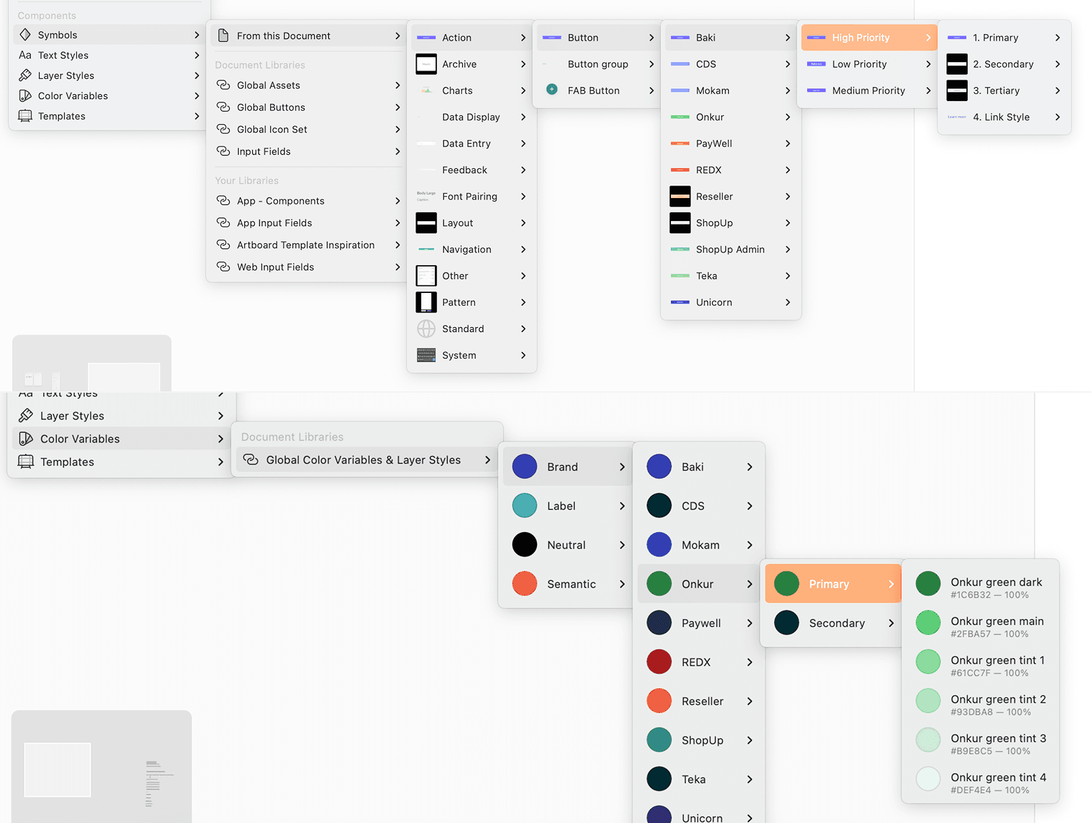
Nested component & color selection in Sketch

Canvas full of redundant components in Sketch
Nested component & color selection in Sketch
Canvas full of redundant components in Sketch
Hard to find
Components were buried in nested Sketch menus, so designers missed them and built duplicates.
Components were buried in nested Sketch menus, so designers missed them and built duplicates.
Manual rebranding
Designers recolored every component by hand, once for each of the eight brands.
Designers recolored every component by hand, once for each of the eight brands.
Unsafe to update
Editing one shared symbol could silently change every screen already live in production.
Editing one shared symbol could silently change every screen already live in production.
Hard to find
No single vendor covers travel, recharge, and conveyance, so HR juggles many partners.
Manual rebranding
Designers recolored every component by hand, once for each of the eight brands.
Unsafe to update
Invoices sit in different places, so finance cannot reconcile cleanly.
Research and findings
Research and findings
UX audit
UX audit
Every app, site, and admin panel
Every app, site, and admin panel
Interviews
Interviews
Designers, developers, PMs, staff, and users
Designers, developers, PMs, staff, and users
Benchmarking
Benchmarking
Mature systems at large companies
Mature systems at large companies
Tool review
Tool review
Tools for components and handoff
Tools for components and handoff
Five problems came up in every product, and each one became
a goal for the new system.
Five problems came up in every product, and each one became
a goal for the new system.
Key findings from research
Key findings from research
Designs looked different in every product
Designs looked different in every product
Designers missed components and built duplicates
Designers missed components and built duplicates
Brand colors were changed by hand
Brand colors were changed by hand
Developers rebuilt UI that already existed
Developers rebuilt UI that already existed
Nobody could maintain the system at scale
Nobody could maintain the system at scale
Goals Established
Goals Established
Build every brand from one set of tokens
Build every brand from one set of tokens
Make every component findable in one search
Make every component findable in one search
Switch brands without editing a single screen
Switch brands without editing a single screen
Hand engineering tokens they can use directly
Hand engineering tokens they can use directly
Document it so it outlives its builders
Document it so it outlives its builders
Key findings from research
Designs looked different in every product
Designers missed components and built duplicates
Brand colors were changed by hand
Developers rebuilt UI that already existed
Nobody could maintain the system at scale
Goals Established
Build every brand from one set of tokens
Make every component findable in one search
Switch brands without editing a single screen
Hand engineering tokens they can use directly
Document it so it outlives its builders
Solution, one flexible system built from three layers of tokens
Solution, one flexible system built from three layers of tokens
Change a primitive and everything referencing it updates. Add a new one instead, for a new brand or, a new requirement, and only the work built from then on picks it up. Screens still on the old references stay as they are, so the system can carry new and legacy design at the same time.
Primitives
The raw values, every color and size the brands need, with no meaning attached yet.
Replace totals with stage-level status, so merchants see exactly where parcels sit.
References
The same values renamed by where they get used, so the system says what a value is for.
Put create, track, pay, and return within a single click of landing.
Component tokens
Each component's own set of values from references, ready for engineering to use in code.
Each component's own set of values from references, ready for engineering to use in code.
Primitive
Colors
Color
Brand / ShopUp / Primary /
Base
Neutral /
Grey 100
Size
Size. 16px
Size. 12px
Reference
Values
Color
Surface / Action /
Base
Text / Link-Brand-Active /
Grey 100
Size
Spacing-3xs /
#Size. 12px
Spacing-2xs /
#Size. 16px
Component
Tokens
Component Color
Button-BG-Primary-Default /
Base
Button-Text-Default /
Grey 100
Button / Primary / Large / Enabled
Button
Solution, one flexible system built from three layers of tokens
Change a primitive and everything referencing it updates. Add a new one instead, for a new brand or, a new requirement, and only the work built from then on picks it up. Screens still on the old references stay as they are, so the system can carry new and legacy design at the same time.
Primitives
No single vendor covers travel, recharge, and conveyance, so HR juggles many partners.
References
The same values renamed by where they get used, so the system says what a value is for.
Component tokens
Each component's own set of values from references, ready for engineering to use in code.
Primitive
Colors
Color
Brand / ShopUp / Primary /
Base
Neutral /
Grey 100
Size
Size. 16px
Size. 12px
Reference
Values
Color
Surface / Action /
Base
Text / Link-Brand-Active /
Grey 100
Size
Spacing-3xs /
#Size. 12px
Spacing-2xs /
#Size. 16px
Component
Tokens
Component Color
Button-BG-Primary-Default /
Base
Button-Text-Default /
Grey 100
Button / Primary / Large / Enabled
Button
Key decisions in the rebuild
Key decisions in the rebuild
Key decisions in the rebuild
01 · DECISION
One library, one mode per brand
One library, one mode per brand
Recoloring by hand was the biggest drain in the old system, so color could no longer sit inside a component. Every component reads from semantic theme variables instead, and each brand is a mode. A designer picks REDX or PayWell and the whole screen takes that brand's colors.
Recoloring by hand was the biggest drain in the old system, so color could no longer sit inside a component. Every component reads from semantic theme variables instead, and each brand is a mode. A designer picks REDX or PayWell and the whole screen takes that brand's colors.
Trade off: Every value had to be named by its use rather than its color, which took the team time to learn.
Trade off: Every value had to be named by its use rather than its color, which took the team time to learn.

02 · DECISION
Fewer components, more control inside each one
Fewer components, more control inside each one
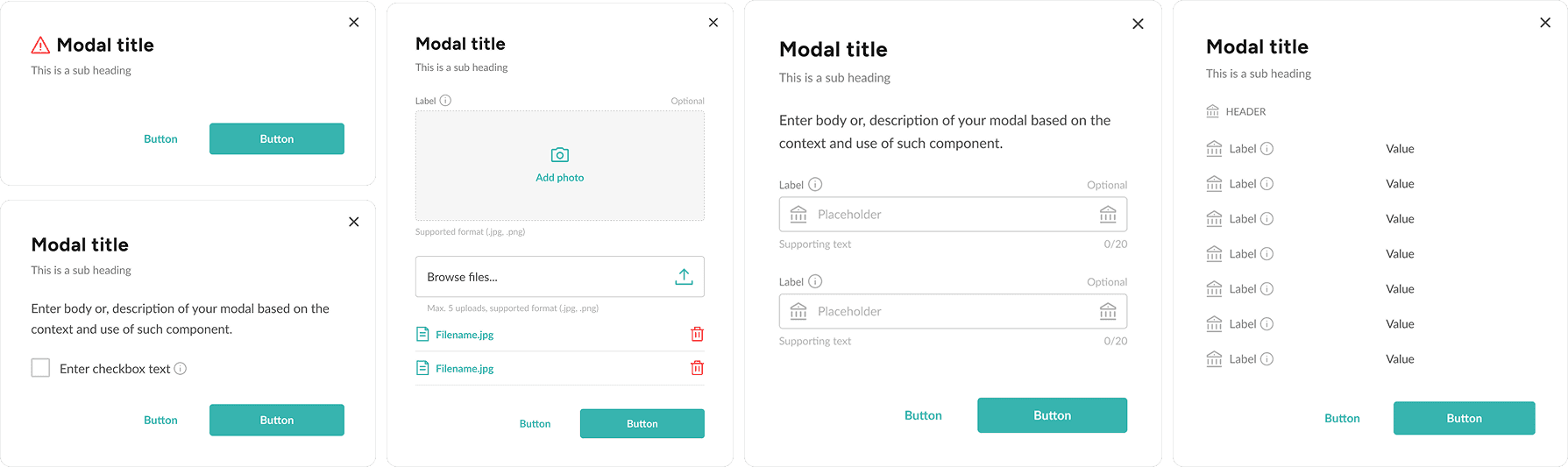
Designers had been answering each new need with a new component, which is how the old library filled with near duplicates. Each component now carries properties for size, type, state, icons, and text, plus placeholder slots that accept other components. One modal covers an alert, an upload, a form, and a data list.
Trade off: Components take far longer to build, in exchange for a library with far fewer of them to maintain.
Designers had been answering each new need with a new component, which is how the old library filled with near duplicates. Each component now carries properties for size, type, state, icons, and text, plus placeholder slots that accept other components. One modal covers an alert, an upload, a form, and a data list.
Trade off: Components take far longer to build, in exchange for a library with far fewer of them to maintain.


Comprehensive
component library
Designers can easily find an overview of all components present in the design system.
Designers can easily find an overview of all components present in the design system.

Intuitive search shows
all similar components
Each component is labeled clearly, allowing basic search functions to showcase all similar variations.
Each component is labeled clearly, allowing basic search functions to showcase all similar variations.

Eliminated
Redundancy
Components are equipped with enough control options, making duplicate variants unnecessary.
Components are equipped with enough control options, making duplicate variants unnecessary.

Comprehensive component library
No single vendor covers travel, recharge, and conveyance, so HR juggles many partners.
Intuitive search shows all similar components
Each component is labeled clearly, allowing basic search functions to showcase all similar variations.
Eliminated Redundancy
Invoices sit in different places, so finance cannot reconcile cleanly.
Placeholder & nesting
components
Placeholder & nesting components
Empty placeholders allowed designers to modify components that requires frequent change without duplicating the original component. Below are some examples demonstrating the solution.
Empty placeholders allowed designers to modify components that requires frequent change without duplicating the original component. Below are some examples demonstrating the solution.

These are the basic components controls that we have for any other components
This placeholder groups allows us to switch and add other components to make a complex one
Example of a swap and placeholder components.
Example of a swap and placeholder components.
03 · DECISION
Documentation that outlives the people who wrote it
Documentation that outlives the people who wrote it
The system had to survive designers leaving and files being replaced, so documentation shipped with each component rather than after it. Every component has a page covering anatomy, states, spacing, breakpoints, color rules, and notes for developers, grouped into four files by type.
Trade off: Each component took longer to release, in exchange for a system anyone can pick up without its original designers.
The system had to survive designers leaving and files being replaced, so documentation shipped with each component rather than after it. Every component has a page covering anatomy, states, spacing, breakpoints, color rules, and notes for developers, grouped into four files by type.
Trade off: Each component took longer to release, in exchange for a system anyone can pick up without its original designers.

Getting it agreed
Getting it agreed
Getting it agreed
Four positions I had to hold, and one I traded.
The flows above shipped. These were the calls that shaped how they feel.
Add more colour to the data
At this density colour is not clarity, it is a puzzle. The one I traded: iconography instead, only where a stage earns it, ranked with merchants and PMs.
At this density colour is not clarity, it is a puzzle. The one I traded: iconography instead, only where a stage earns it, ranked with merchants and PMs.
Show less data
Less data was the problem, not the fix. I brought the support tickets, Play Store reviews, and social analysis I had already run. Evidence, not opinion.
Less data was the problem, not the fix. I brought the support tickets, Play Store reviews, and social analysis I had already run. Evidence, not opinion.
Make the banners bigger, like the website
Make the banners bigger,
like the website
No merchant asked for it, and this is where someone handles thousands of parcels a day. REDX has social channels for offers.
No merchant asked for it, and this is where someone handles thousands of parcels a day. REDX has social channels for offers.
We do not want a new design system
The fair objection was cost. Mine was that the shared system already cost more: seven engineering teams in the path of every change, and no dark mode.
The fair objection was cost. Mine was that the shared system already cost more: seven engineering teams in the path of every change, and no dark mode.
Add more colour to the data
No single vendor covers travel, recharge, and conveyance, so HR juggles many partners.
Make the banners bigger, like the website
No merchant asked for it, and this is where someone handles thousands of parcels a day. REDX has social channels for offers.
Show less data
Invoices sit in different places, so finance cannot reconcile cleanly.
We do not want a new design system
Invoices sit in different places, so finance cannot reconcile cleanly.
Impact
Impact
Before vs after launch, from analytics, Hotjar events, and support ticket volume.
Before vs after launch, from analytics, Hotjar events, and support ticket volume.
27.6%
Faster time to first parcel
20%
Fewer support disbursement tickets
17.8%
More invoice views per merchant
12%
Better on-time dues paid
27.6%
Faster time to first parcel
17.8%
More invoice views per merchant
20%
Fewer support disbursement tickets
12%
Better on-time dues paid
Time to first parcel
New merchants used to sign up, fail to find where to start, and come back days later, if they came back. Now they create one in the same session.
New merchants used to sign up, fail to find where to start, and come back days later, if they came back. Now they create one in the same session.
Disbursement tickets
The calls that stopped were visibility questions: what is pending, what lands tomorrow. What remains is payment timing, a policy question, not an interface one.
The calls that stopped were visibility questions: what is pending, what lands tomorrow. What remains is payment timing, a policy question, not an interface one.
Reflection
Research outran the plan
Research outran the plan
A month of a two-month project, which left less room for exploration. Still the right trade, but I would scope it tighter.
A month of a two-month project, which left less room for exploration. Still the right trade, but I would scope it tighter.
Analytics only worked in aggregate
Analytics only worked in aggregate
Merchants share one login across staff, so nothing user-level from Hotjar held up. Every insight that changed the design came from interviews.
Merchants share one login across staff, so nothing user-level from Hotjar held up. Every insight that changed the design came from interviews.
Stage breakdowns beat totals
Stage breakdowns beat totals
Merchants valued knowing which parcels were stuck far more than knowing how many had been delivered.
Merchants valued knowing which parcels were stuck far more than knowing how many had been delivered.
The left rail earned its space
The left rail earned its space
The one decision merchants named unprompted, and it leaves room for services REDX has not built yet.
The one decision merchants named unprompted, and it leaves room for services REDX has not built yet.
Mobile needed its own structure
Mobile needed its own structure
Compressing the desktop layout would have buried the same numbers again. Splitting it into two tabs is what worked.
Compressing the desktop layout would have buried the same numbers again. Splitting it into two tabs is what worked.
The desktop dashboard is still dense
The desktop dashboard is still dense
One-on-one testing is the next step, to find what can come off without losing the drill-down.
One-on-one testing is the next step, to find what can come off without losing the drill-down.
Reflection
Break complexity into reusable parts
Shared components kept a feature heavy app coherent, and made each new flow faster to build.
Let research lead
The HR interviews and competitor study drove the structure, not my assumptions
A new market runs on some assumptions
This is a first mover in Bangladesh, and no one enters an untested market on research alone. The beta is how we learn which bets hold.
What I would change
Running a build this large solo taught me pacing. Next time I would validate the booking flows with real users before shipping.
What happened next
What happened next
The dashboard bought the rest of the site
The dashboard bought the rest of the site
REDX is revamping the whole panel now, flow by flow, migrating each one onto the new design system.
REDX is revamping the whole panel now, flow by flow, migrating each one onto the new design system.
Research runs with every flow
Research runs with every flow
Short interview bursts as each one is redesigned, so pain points surface during the work instead of after launch.
Short interview bursts as each one is redesigned, so pain points surface during the work instead of after launch.
Merchants asked for an app
Merchants asked for an app
Responsive web covers the dashboard. Everything else still needs a desktop, and they want notifications, parcel creation, and live sales on their phone.
Responsive web covers the dashboard. Everything else still needs a desktop, and they want notifications, parcel creation, and live sales on their phone.
The dashboard bought the rest of the site
REDX is revamping the whole panel now, flow by flow, migrating each one onto the new design system.
Research runs with every flow
Short interview bursts as each one is redesigned, so pain points surface during the work instead of after launch.
Merchants asked for an app
Responsive web covers the dashboard. Everything else still needs a desktop, and they want notifications, parcel creation, and live sales on their phone.
The first full REDX app
The first full REDX app
The old one showed data, carried none of the branding, and had no logistics features. I am designing this one with merchants now.
The old one showed data, carried none of the branding, and had no logistics features. I am designing this one with merchants now.
A wider market
A wider market
An app brings in small and hobby sellers, not only merchants shipping hundreds of parcels a day.
An app brings in small and hobby sellers, not only merchants shipping hundreds of parcels a day.
The first full REDX app
The old one showed data, carried none of the branding, and had no logistics features. I am designing this one with merchants now.
A wider market
An app brings in small and hobby sellers, not only merchants shipping hundreds of parcels a day.