ShopUp Unified
Design System
Creating a seamless user experience across all ShopUp products.

Imagine designing seamless user experiences for
Imagine designing seamless user experiences for
31
31
Million
Users
Million
Users
12
12
Mobile
Apps
Mobile
Apps
08
08
Unique
Brands
Unique
Brands
30
30
ShopUp
Teams
ShopUp
Teams
16
16
Admin
Panels
Admin
Panels
That's the challenge I tackled at ShopUp. From managing finance requests with intricate approval chains to supporting delivery hubs and warehouses across Bangladesh. ShopUp's internal operations are a complex ecosystem.
That's the challenge I tackled at ShopUp. From managing finance requests with intricate approval chains to supporting delivery hubs and warehouses across Bangladesh. ShopUp's internal operations are a complex ecosystem.
My Responsibilities
My Responsibilities
Research & User Insights
Designed and conducted user surveys and interviews.
Analyzed data to identify user needs and pain points.
Designed and conducted user surveys and interviews.
Analyzed data to identify user needs and pain points.
Team Leadership
Led a team of 4 designers to plan and manage workload.
Established timelines, coordinated UI audits and, component reviews.
Led a team of 4 designers to plan and manage workload.
Established timelines, coordinated UI audits and, component reviews.
Design Execution
Contributed to the creation of design components.
Developed comprehensive documentation of the components & patterns.
Contributed to the creation of design components.
Developed comprehensive documentation of the components & patterns.
Challenge: Existing Design System in 💎 Sketch
Challenge: Existing Design System in 💎 Sketch

Results 🏆Achieved
Results 🏆Achieved
1 Platform,
Seamless Design
1 Platform, Seamless Design
Unified library for mobile, web, and admin panels
Unified library for mobile, web, and admin panels
Unified library for mobile, web, and admin panels
3-Day Design
Sprints
3-Day Design Sprints
Design sprints slashed from 5 to 3 days - boosted efficiency
Design sprints slashed from 5 to 3 days - boosted efficiency
1.5-Days Deployment Boost
1.5-Days Deployment Boost
Development cycles increased by 1.5 days - unlocks agility
Development cycles increased by 1.5 days - unlocks agility
Unified Brand,
Happy Users
Unified Brand, Happy Users
Harmonious interactions & brand identity, user satisfaction up 25%
Harmonious interactions & brand identity, user satisfaction up 25%
117 Categories,
1500+ Variations
117 Categories, 1500+ Variations
Extensive component library with design flexibility and detailed UI patterns
Extensive component library with design flexibility and detailed UI patterns
Saved $4,500 & Improved Scalability
Saved $4,500 & Improved Scalability
Switching everything to Figma saved a huge annual budget & streamlined workflow
Switching everything to Figma saved a huge annual budget & streamlined workflow
PROBLEM STATEMENT
Inefficiencies in the Design System hinder Design & Development Workflow.
Sketch & Zeplin system hinders design, handoff, & raises costs.
Sketch & Zeplin system hinders design, handoff, & raises costs.
Delays projects, struggles to manage 8 brands & creating inconsistent experiences.
Delays projects, struggles to manage 8 brands & creating inconsistent experiences.
Sketch & Zeplin Designs require manual intervention impacting entire design workflow. hinders design, handoff, & raises costs.
Sketch & Zeplin Designs require manual intervention impacting entire design workflow. hinders design, handoff, & raises costs.
Project Timeline

Research Methodology
Research Methodology
Used a multi-pronged research approach to understand challenges affecting user experience across ShopUp's products.
Comprehensive UX Audit
Comprehensive UX Audit
Analyzed all app, websites, and admin panels to identify inconsistencies & improvement areas.
User Interviews
User Interviews
Interviewed users to understand the design system's impact on efficiency and experience.
Competitor Benchmarking
Competitor Benchmarking
Compared ShopUp's design system with industry leaders to adopt best practices.
Developer & PM Insights
Developer & PM Insights
Engaged developers and PMs to identify challenges to improve consistency.
Tool Exploration
Tool Exploration
Researched new tools to enhance component management and optimize workflow.
Best Practices
Best Practices
Explored methods for managing design systems for large companies.
Key Findings
Key Findings
Inconsistent designs across products fragmented the brand.
Inconsistent designs across products fragmented the brand.
Varied UI patterns hindered a seamless user experience.
Varied UI patterns hindered a seamless user experience.
Designers missed components, leading to duplicate efforts.
Designers missed components, leading to duplicate efforts.
Manual color changes extended design timelines.
Manual color changes extended design timelines.
Developers duplicated UI components, slowing development.
Developers duplicated UI components, slowing development.
Scaling and maintaining the design system was difficult.
Scaling and maintaining the design system was difficult.
Goals Established
Goals Established
Streamline design process with tokens and variables.
Streamline design process with tokens and variables.
Facilitate easy access and modification of components.
Facilitate easy access and modification of components.
Improve component organization and searchability.
Improve component organization and searchability.
Centralize brand color application for all business units.
Centralize brand color application for all business units.
Enhance developer handoff with clear documentation.
Enhance developer handoff with clear documentation.
Establish a robust, scalable component structure.
Establish a robust, scalable component structure.
Streamlining Design System with Figma
Streamlining Design System with Figma
That's the challenge I tackled at ShopUp. From managing finance requests with intricate approval chains to supporting delivery hubs and warehouses across Bangladesh. ShopUp's internal operations are a complex ecosystem.
That's the challenge I tackled at ShopUp. From managing finance requests with intricate approval chains to supporting delivery hubs and warehouses across Bangladesh. ShopUp's internal operations are a complex ecosystem.
Building a Flexible
Design System with Figma
Building a Flexible
Design System with Figma
Building Blocks:
Primitive Variables
We created foundational variables for size and color, which would be referenced to build the components.
We created foundational variables for size and color, which would be referenced to build the components.
Design Language: Component Variables
Referencing these core primitives, we created color, string, number, & boolean variables to be used in component design.
Referencing these core primitives, we created color, string, number, & boolean variables to be used in component design.
Developer Integration:
Component Tokens
Furthermore, each component was assigned its own set of variables to create tokens for devs to embed in the UI Kit.
Furthermore, each component was assigned its own set of variables to create tokens for devs to embed in the UI Kit.

Figma's Modes: Streamlined Branding
Figma's Modes: Streamlined Branding
One system, all brands. Designers select their brand mode, and components adapt with the right colors automatically.
One system, all brands. Designers select their brand mode, and components adapt with the right colors automatically.

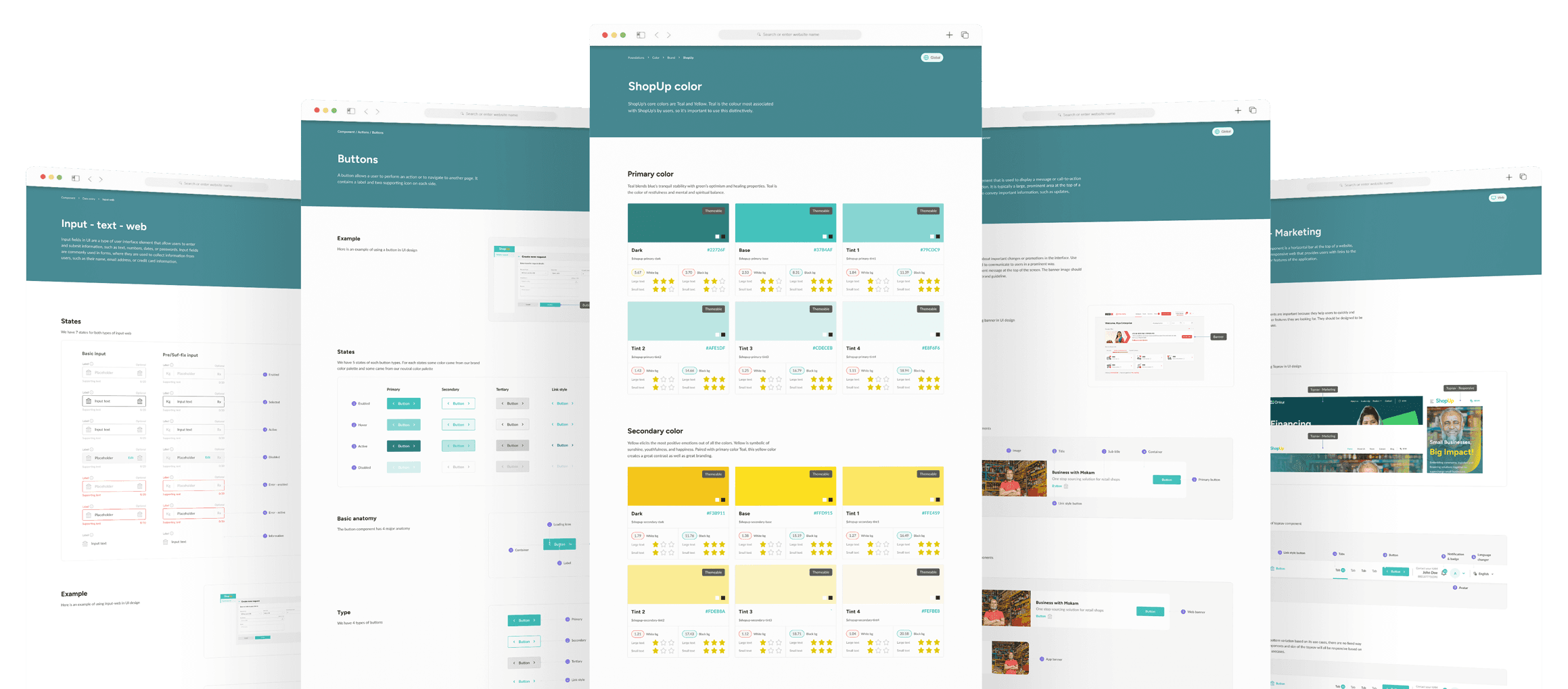
A Design system that can handle 8 business units of ShopUp
A Design system that can handle 8 business units of ShopUp
" width="150px"><path d="M 0 45 L 0 0 L 150 0 L 150 45 Z" fill="transparent" height="45px" id="cWlxm3n8j" transform="translate(0 0.5)" width="150px"/><path d="M 0 28.715 L 5.768 24.076 C 7.403 26.953 9.992 28.623 12.943 28.623 C 16.17 28.623 17.895 26.49 17.895 24.168 C 17.895 21.384 14.578 20.503 11.036 19.392 C 6.584 17.999 1.635 16.237 1.635 9.742 C 1.635 4.314 6.268 0 12.675 0 C 18.08 0 21.169 2.088 23.848 4.917 L 18.624 8.953 C 17.261 6.865 15.307 5.751 12.718 5.751 C 9.767 5.751 8.176 7.373 8.176 9.509 C 8.176 12.108 11.355 12.989 14.897 14.193 C 19.393 15.678 24.483 17.718 24.483 24.213 C 24.483 29.593 20.303 34.792 12.99 34.792 C 6.994 34.792 2.998 32.192 0 28.715 Z" fill="rgb(55, 180, 175)" height="34.7916px" id="i6HuihJ9I" width="24.4829px"/><path d="M 0 0 L 6.178 0 L 6.178 13.223 C 7.675 11.367 9.858 10.208 12.446 10.208 C 17.805 10.208 21.031 13.734 21.031 19.717 L 21.031 33.866 L 14.719 33.866 L 14.719 20.599 C 14.719 17.444 13.313 15.633 10.539 15.633 C 8.179 15.633 6.225 17.303 6.225 21.199 L 6.225 33.862 L 0.003 33.862 L 0.003 0 Z" fill="rgb(55, 180, 175)" height="33.865709px" id="xeI5ag7uM" transform="translate(26.158 0.463)" width="21.031399999999998px"/><path d="M 0 12.06 C 0 5.38 5.224 0 11.765 0 C 18.305 0 23.529 5.38 23.529 12.06 C 23.529 18.74 18.305 24.12 11.765 24.12 C 5.224 24.12 0 18.74 0 12.06 Z M 17.489 12.06 C 17.489 8.765 14.944 6.028 11.765 6.028 C 8.585 6.028 6.087 8.765 6.087 12.06 C 6.087 15.355 8.542 18.092 11.765 18.092 C 14.988 18.092 17.489 15.355 17.489 12.06 Z" fill="rgb(55, 180, 175)" height="24.1202px" id="KTfghiOZk" transform="translate(48.772 10.671)" width="23.529399999999995px"/><path d="M 6.222 21.384 L 6.222 34.329 L 0 34.329 L 0 0.463 L 6.222 0.463 L 6.222 3.107 C 7.675 1.296 9.992 0 13.034 0 C 18.168 0 24.026 3.851 24.026 12.06 C 24.026 20.269 17.939 24.12 13.124 24.12 C 10.126 24.12 7.675 23.098 6.222 21.384 Z M 17.939 12.012 C 17.939 8.439 15.304 5.795 11.852 5.795 C 8.4 5.795 6.037 8.58 6.037 12.012 C 6.037 15.445 8.491 18.274 11.852 18.274 C 15.213 18.274 17.939 15.582 17.939 12.012 Z" fill="rgb(55, 180, 175)" height="34.3287px" id="hqUM5ApBj" transform="translate(73.886 10.671)" width="24.026399999999995px"/><path d="M 0.003 22.128 L 0.003 0 L 6.316 0 L 6.316 22.546 C 6.316 25.794 8.723 28.345 11.902 28.345 C 15.082 28.345 17.627 25.794 17.627 22.546 L 17.627 0 L 23.939 0 L 23.939 22.128 C 23.939 30.2 18.852 34.329 11.946 34.329 C 5.04 34.329 0 30.2 0 22.128 Z" fill="rgb(255, 217, 21)" height="34.328709px" id="PLywzMXfO" transform="translate(99.54 0.463)" width="23.938999999999993px"/><path d="M 6.221 21.384 L 6.221 34.329 L 0 34.329 L 0 0.463 L 6.221 0.463 L 6.221 3.107 C 7.675 1.296 9.992 0 13.033 0 C 18.167 0 24.026 3.851 24.026 12.06 C 24.026 20.269 17.939 24.12 13.124 24.12 C 10.126 24.12 7.675 23.098 6.221 21.384 Z M 17.939 12.012 C 17.939 8.439 15.303 5.795 11.852 5.795 C 8.4 5.795 6.036 8.58 6.036 12.012 C 6.036 15.445 8.491 18.274 11.852 18.274 C 15.212 18.274 17.939 15.582 17.939 12.012 Z" fill="rgb(255, 217, 21)" height="34.3287px" id="U89VsB4z7" transform="translate(125.974 10.671)" width="24.025999999999996px"/></g></svg>)
" width="133px"><path d="M 0 33 L 0 0 L 133 0 L 133 33 Z" fill="transparent" height="33px" id="yT8BqIE3W" transform="translate(0 0.5)" width="133px"/><path d="M 11.856 32.94 L 0 32.94 L 9.126 16.451 L 0.017 0 L 11.876 0 L 20.985 16.455 Z" fill="rgb(235, 33, 39)" height="32.939553100000005px" id="jDUZ7bIvz" transform="translate(97.536 0.061)" width="20.984899999999996px"/><path d="M 5.329 16.475 L 5.316 16.455 L 5.319 16.451 L 5.316 16.451 L 0 6.851 L 3.793 0 L 15.652 0 L 6.553 16.475 L 15.669 32.94 L 3.813 32.94 L 0 26.055 Z" fill="rgb(235, 33, 39)" height="32.9395609px" id="GTkYm2AQV" transform="translate(117.33 0.04)" width="15.668999999999997px"/><path d="M 14.146 0 C 23.651 0 28.994 4.486 28.994 12.489 C 28.994 17.408 27.049 20.867 23.594 22.869 L 30.128 31.845 L 30.128 32.98 L 19.382 32.98 L 13.335 24.709 L 10.095 24.709 L 10.095 32.98 L 0 32.98 L 0 0 Z M 14.794 16.653 C 17.547 16.653 19.06 15.138 19.06 12.489 C 19.06 9.839 17.333 8.436 14.254 8.436 L 10.095 8.436 L 10.095 16.653 Z" fill="rgb(46, 46, 46)" height="32.9799px" id="qFk3rJweM" width="30.1276px"/><path d="M 0.003 32.98 L 0.003 0 L 25.003 0 L 25.003 8.436 L 9.991 8.436 L 9.991 12.653 L 22.736 12.653 L 22.736 20.548 L 9.991 20.548 L 9.991 24.494 L 25.432 24.494 L 25.432 32.983 L 0 32.983 Z" fill="rgb(46, 46, 46)" height="32.9832px" id="aVdULTF9V" transform="translate(32.935 0)" width="25.432199999999995px"/><path d="M 12.852 0 C 24.624 0 31.264 5.947 31.264 16.488 C 31.264 27.029 24.624 32.98 12.852 32.98 L 0 32.98 L 0 0 Z M 12.852 24.383 C 18.091 24.383 21.059 21.572 21.059 16.488 C 21.059 11.404 18.091 8.54 12.852 8.54 L 10.098 8.54 L 10.098 24.38 L 12.852 24.38 Z" fill="rgb(46, 46, 46)" height="32.9799px" id="M_XyTgEMO" transform="translate(62.312 0)" width="31.26449999999999px"/></g></svg>)
" height="37.9496094px" id="Gv42Sd0XE" transform="translate(0.637 0.025)" width="37.949581px"/><path d="M 4.042 19.893 L 0 19.893 L 0 7.612 C 0 2.551 2.667 0 7.965 0 C 10.828 0 12.789 0.942 13.85 2.863 C 14.91 0.942 16.871 0 19.734 0 C 25.226 0 27.659 2.589 27.659 7.612 L 27.659 19.893 L 23.617 19.893 L 23.617 7.612 C 23.617 4.945 22.754 3.767 19.734 3.767 C 16.715 3.767 15.771 4.943 15.771 7.612 L 15.771 19.893 L 11.848 19.893 L 11.848 7.612 C 11.848 4.945 10.984 3.767 7.965 3.767 C 4.945 3.767 4.042 4.943 4.042 7.612 Z" fill="rgb(0, 70, 160)" height="19.89291px" id="RzHo74UYE" transform="translate(44.586 8.838)" width="27.658899999999996px"/><path d="M 0 11.848 L 0 8.473 C 0 2.981 2.941 0 9.022 0 C 15.104 0 17.967 2.825 17.967 8.473 L 17.967 11.848 C 17.967 17.302 15.025 20.321 9.022 20.321 C 3.019 20.321 0 17.496 0 11.848 Z M 13.928 8.473 C 13.928 5.177 12.83 3.765 9.022 3.765 C 5.215 3.765 4.039 5.177 4.039 8.473 L 4.039 11.848 C 4.039 15.104 5.137 16.516 9.022 16.516 C 12.908 16.516 13.928 15.144 13.928 11.848 Z" fill="rgb(0, 70, 160)" height="20.32118px" id="KwAvcUL_Y" transform="translate(74.793 8.841)" width="17.96669999999999px"/><path d="M 0 19.89 L 0 0 L 4.001 0 L 4.001 19.89 Z M 11.966 0.431 L 17.028 0.431 L 10.123 8.199 C 9.612 8.71 9.337 9.181 9.337 9.612 C 9.337 9.964 9.572 10.435 10.083 10.984 L 17.811 19.89 L 12.749 19.89 L 6.905 13.104 C 5.845 11.888 5.336 10.712 5.336 9.496 C 5.336 8.279 5.651 7.534 6.905 6.162 L 11.966 0.433 Z" fill="rgb(0, 70, 160)" height="19.89048px" id="ZVukYggNA" transform="translate(95.701 8.841)" width="17.810800170898432px"/><path d="M 16.322 14.044 C 16.322 18.397 13.771 20.321 7.964 20.321 C 2.669 20.321 0 18.319 0 14.28 C 0 10.241 2.825 8.355 8.002 8.355 L 12.318 8.355 L 12.318 6.434 C 12.318 4.12 10.787 3.452 7.69 3.452 C 5.298 3.452 3.452 3.687 2.12 4.198 L 2.12 0.667 C 3.454 0.237 5.22 0 7.456 0 C 13.144 0 16.322 1.765 16.322 6.434 L 16.322 14.046 Z M 12.321 11.415 L 8.005 11.415 C 5.298 11.415 4.041 12.2 4.041 14.2 C 4.041 16.199 5.532 16.907 7.886 16.907 C 10.83 16.907 12.321 16.317 12.321 13.847 Z" fill="rgb(0, 70, 160)" height="20.32118px" id="Av1b4f9Yq" transform="translate(113.512 8.841)" width="16.322000000000003px"/><path d="M 4.041 19.893 L 0 19.893 L 0 7.612 C 0 2.551 2.667 0 7.965 0 C 10.828 0 12.789 0.942 13.849 2.863 C 14.909 0.942 16.871 0 19.734 0 C 25.226 0 27.659 2.589 27.659 7.612 L 27.659 19.893 L 23.617 19.893 L 23.617 7.612 C 23.617 4.945 22.753 3.767 19.734 3.767 C 16.715 3.767 15.771 4.943 15.771 7.612 L 15.771 19.893 L 11.848 19.893 L 11.848 7.612 C 11.848 4.945 10.984 3.767 7.965 3.767 C 4.945 3.767 4.041 4.943 4.041 7.612 Z" fill="rgb(0, 70, 160)" height="19.89291px" id="f8SKu6mp8" transform="translate(132.382 8.838)" width="27.658999999999992px"/><path d="M 2.128 13.762 L 4.196 11.687 L 9.24 15.044 L 8.429 15.858 C 6.689 17.605 6.689 20.447 8.429 22.193 C 10.168 23.939 12.999 23.939 14.739 22.193 C 16.478 20.447 16.478 17.605 14.739 15.858 L 13.928 15.044 L 18.972 11.687 L 21.046 13.769 L 23.173 11.635 L 11.583 0 L 0 11.628 L 2.126 13.762 Z M 11.583 4.271 L 16.801 9.51 L 11.583 12.983 L 6.364 9.51 Z M 10.555 20.061 C 9.987 19.491 9.987 18.565 10.555 17.995 L 11.583 16.963 L 12.61 17.995 C 13.178 18.565 13.178 19.491 12.61 20.061 C 12.042 20.631 11.121 20.631 10.553 20.061 Z" fill="rgb(0, 70, 160)" height="23.502540000000003px" id="aAKQ5P5XX" transform="translate(7.951 7.616)" width="23.17253px"/></svg>)
" width="175.0030041503906px"><path d="M 0 36 L 0 0 L 175 0 L 175 36 Z" fill="transparent" height="36px" id="IjmlDoqJJ" transform="translate(0 0.013)" width="175px"/><path d="M 32.172 0.029 C 32.23 0.342 32.144 0.542 31.936 0.77 C 30.863 1.959 29.827 3.178 28.778 4.383 C 26.389 7.131 24.003 9.875 21.614 12.623 C 21.233 13.062 21.243 13.493 21.644 13.917 C 23.138 15.486 24.639 17.041 26.122 18.62 C 28.18 20.811 30.121 23.093 31.786 25.606 C 32.062 26.024 32.179 26.418 32.179 26.907 C 32.179 28.432 31.895 29.892 31.307 31.298 C 30.938 32.181 30.261 32.8 29.516 33.353 C 29.304 33.509 29.113 33.425 28.962 33.251 C 28.46 32.667 27.971 32.069 27.469 31.485 C 27.339 31.332 27.182 31.203 27.038 31.068 C 27.007 31.091 26.98 31.112 26.949 31.135 C 26.997 31.227 27.028 31.329 27.089 31.407 C 27.4 31.818 27.575 32.28 27.653 32.786 C 27.694 33.048 27.629 33.241 27.407 33.411 C 26.559 34.06 25.65 34.515 24.55 34.542 C 23.299 34.572 22.383 34.022 21.713 33.01 C 21.309 32.402 21.053 31.73 20.981 30.993 C 20.927 30.432 20.855 29.875 20.793 29.315 C 20.756 28.955 20.503 28.768 20.021 28.741 C 19.471 28.711 18.913 28.7 18.37 28.626 C 16.794 28.408 15.29 27.977 13.951 27.074 C 13.38 26.69 12.806 26.303 12.235 25.915 C 11.257 25.257 10.546 24.367 10.01 23.328 C 9.811 22.947 9.709 22.93 9.367 23.185 C 8.495 23.83 7.579 24.428 6.745 25.121 C 4.66 26.849 3.081 28.958 2.237 31.563 C 2.049 32.137 1.957 32.742 1.813 33.333 C 1.765 33.523 1.793 33.781 1.485 33.785 C 1.304 33.785 1.188 33.723 1.174 33.516 C 1.072 31.872 1.232 30.266 1.759 28.69 C 2.74 25.739 4.558 23.382 6.827 21.341 C 7.921 20.356 9.182 19.653 10.577 19.191 C 10.823 19.109 11.059 18.991 11.305 18.906 C 11.548 18.821 11.684 18.916 11.708 19.177 C 11.784 19.965 11.804 20.767 11.958 21.541 C 12.235 22.947 12.703 24.299 13.609 25.437 C 14.135 26.095 14.918 26.394 15.69 26.663 C 16.975 27.108 18.298 27.213 19.645 27.07 C 19.85 27.05 20.052 26.965 20.257 26.951 C 21.309 26.897 22.427 27.485 22.793 28.612 C 22.991 29.217 23.094 29.852 23.292 30.456 C 23.415 30.826 23.623 31.176 23.835 31.509 C 23.969 31.72 24.184 31.886 24.474 31.815 C 24.744 31.747 24.813 31.516 24.905 31.285 C 25.049 30.928 25.202 30.568 25.418 30.256 C 25.64 29.93 26.006 29.75 26.402 29.818 C 27.14 29.943 27.875 30.089 28.597 30.286 C 28.887 30.368 29.055 30.32 29.143 30.069 C 29.355 29.478 29.554 28.884 29.735 28.283 C 29.875 27.824 29.971 27.349 30.118 26.89 C 30.2 26.635 30.172 26.432 30.042 26.208 C 29.044 24.469 27.872 22.852 26.6 21.307 C 25.271 19.69 23.938 18.07 22.4 16.651 C 20.523 14.922 18.599 13.248 16.695 11.549 C 16.586 11.451 16.487 11.335 16.36 11.268 C 15.848 10.992 15.711 10.517 15.642 9.994 C 15.417 8.279 14.579 6.91 13.281 5.806 C 13.147 5.691 13.017 5.565 12.87 5.467 C 12.71 5.358 12.57 5.382 12.518 5.596 C 12.491 5.708 12.46 5.82 12.453 5.936 C 12.406 6.815 12.358 7.691 12.317 8.571 C 12.276 9.498 12.242 10.429 12.211 11.356 C 12.204 11.594 12.098 11.746 11.883 11.838 C 11.261 12.106 10.639 12.378 10.016 12.653 C 8.499 13.322 7.176 14.29 5.932 15.367 C 3.686 17.313 1.926 19.653 0.508 22.258 C 0.443 22.377 0.262 22.431 0.132 22.512 C 0.087 22.38 -0.026 22.227 0.005 22.118 C 0.234 21.381 0.453 20.634 0.75 19.921 C 1.54 18.036 2.606 16.314 3.891 14.728 C 4.999 13.36 6.291 12.195 7.757 11.223 C 8.28 10.88 8.817 10.558 9.36 10.245 C 9.572 10.123 9.647 9.97 9.644 9.736 C 9.634 9.002 9.61 8.269 9.637 7.535 C 9.685 6.292 9.726 5.046 9.852 3.813 C 9.938 2.984 10.163 2.172 10.331 1.354 C 10.379 1.12 10.529 1.052 10.755 1.137 C 13.069 2.013 15.078 3.307 16.449 5.436 C 16.958 6.224 17.338 7.073 17.433 8.024 C 17.488 8.554 17.546 9.08 17.58 9.61 C 17.604 9.933 17.792 10.143 18.038 10.272 C 18.141 10.323 18.36 10.235 18.479 10.147 C 19.16 9.644 19.826 9.121 20.496 8.608 C 22.762 6.876 25.028 5.151 27.294 3.419 C 28.689 2.352 30.087 1.296 31.464 0.209 C 31.697 0.026 31.895 -0.032 32.172 0.016" fill="rgb(69, 70, 157)" height="34.54310666037084px" id="sVzOo6X04" transform="translate(12.245 0)" width="32.189557828373474px"/><path d="M 18.139 0.258 C 18.044 0.228 17.931 0.251 17.828 0.245 C 16.611 0.163 15.395 0.058 14.174 0.01 C 13.532 -0.017 12.879 0.01 12.24 0.092 C 11.29 0.211 10.326 0.319 9.41 0.577 C 8.077 0.954 6.798 1.488 5.599 2.208 C 3.756 3.315 2.239 4.758 1.114 6.585 C 0.677 7.299 0.376 8.097 0.034 8.868 C -0.01 8.966 0.079 9.126 0.106 9.258 C 0.253 9.214 0.461 9.221 0.537 9.122 C 1.596 7.774 2.875 6.667 4.303 5.746 C 6.234 4.5 8.347 3.675 10.582 3.162 C 10.654 3.145 10.732 3.162 10.896 3.162 C 10.767 3.332 10.695 3.44 10.606 3.532 C 9.915 4.259 9.201 4.965 8.528 5.709 C 6.829 7.591 5.318 9.625 4.006 11.792 C 2.895 13.626 1.989 15.565 1.34 17.62 C 0.892 19.039 0.571 20.483 0.355 21.953 C 0.291 22.408 0.25 22.867 0.181 23.322 C 0.144 23.577 0.034 23.821 0.021 24.073 C -0.003 24.568 0.01 25.068 0 25.567 L 2.933 25.567 C 2.875 25.254 2.81 24.945 2.803 24.633 C 2.772 23.336 2.7 22.031 2.786 20.741 C 2.875 19.41 3.073 18.075 3.343 16.767 C 3.538 15.816 3.886 14.886 4.242 13.976 C 4.553 13.177 4.905 12.383 5.342 11.649 C 5.838 10.82 6.426 10.043 7.01 9.272 C 8.186 7.72 9.649 6.45 11.129 5.213 C 12.988 3.658 15.073 2.439 17.22 1.321 C 17.561 1.141 17.914 0.978 18.242 0.778 C 18.344 0.713 18.389 0.554 18.46 0.438 C 18.355 0.377 18.255 0.299 18.143 0.265" fill="rgb(237, 58, 151)" height="25.566801563038794px" id="UfzqJ2AQN" transform="translate(0 10.445)" width="18.4604px"/><path d="M 3.27 3 C 3.27 3.578 2.717 3.961 2.231 3.809 C 1.595 3.608 1.093 3.201 0.806 2.613 C 0.536 2.066 0.372 1.469 0.167 0.891 C 0.105 0.715 0.044 0.535 0.01 0.351 C -0.011 0.243 0.003 0.032 0.04 0.025 C 0.167 -0.005 0.344 -0.019 0.444 0.049 C 0.847 0.327 1.26 0.603 1.606 0.942 C 2.125 1.452 2.604 2.002 3.075 2.555 C 3.195 2.695 3.233 2.912 3.27 3 Z" fill="rgb(237, 58, 151)" height="3.8422431484418045px" id="EWqDlOkkF" transform="translate(29.573 15.318)" width="3.2702374757544277px"/><path d="M 15.572 12.352 C 15.572 14.39 15.326 16.013 14.834 17.219 C 14.342 18.425 13.539 19.301 12.424 19.851 C 11.31 20.401 9.82 20.673 7.947 20.673 C 5.978 20.673 4.419 20.398 3.278 19.851 C 2.136 19.301 1.302 18.425 0.783 17.219 C 0.26 16.013 0 14.39 0 12.352 L 0 0 L 3.695 0 L 3.695 12.352 C 3.695 13.666 3.821 14.696 4.078 15.439 C 4.334 16.183 4.758 16.72 5.349 17.042 C 5.941 17.365 6.757 17.528 7.803 17.528 C 8.849 17.528 9.632 17.365 10.213 17.042 C 10.794 16.72 11.214 16.186 11.471 15.439 C 11.727 14.696 11.854 13.666 11.854 12.352 L 11.854 0 L 15.576 0 L 15.576 12.352 Z" fill="rgb(69, 70, 157)" height="20.6729px" id="TYz5En47b" transform="translate(51.953 11.262)" width="15.575700000000005px"/><path d="M 16.577 18.941 C 16.577 19.844 16.123 20.292 15.217 20.292 L 12.291 20.292 C 11.898 20.292 11.584 20.204 11.344 20.028 C 11.108 19.851 10.91 19.566 10.753 19.175 L 5.021 6.735 C 4.806 6.283 4.573 5.77 4.327 5.19 C 4.081 4.612 3.91 4.116 3.811 3.705 L 3.456 3.705 C 3.575 4.531 3.633 5.55 3.633 6.765 L 3.633 20.292 L 0 20.292 L 0 1.352 C 0 0.92 0.12 0.588 0.356 0.353 C 0.591 0.119 0.937 0 1.391 0 L 4.259 0 C 4.652 0 4.963 0.088 5.189 0.265 C 5.414 0.441 5.616 0.727 5.794 1.117 L 11.348 13.205 L 11.819 14.291 C 12.134 14.92 12.448 15.626 12.766 16.411 L 13.122 16.411 C 13.023 15.174 12.975 14.077 12.975 13.116 L 12.975 0 L 16.581 0 L 16.581 18.941 Z" fill="rgb(69, 70, 157)" height="20.292499999999997px" id="Jdy5Qw0kg" transform="translate(72.519 11.262)" width="16.580600000000004px"/><path d="M 3.746 0 L 0 0 L 0 20.231 L 3.746 20.231 Z" fill="rgb(69, 70, 157)" height="20.2314px" id="HW2temp19" transform="translate(93.222 11.227)" width="3.7460999999999984px"/><path d="M 11.543 0.149 C 12.38 0.248 13.252 0.414 14.157 0.649 L 13.802 3.444 C 12.09 3.308 10.257 3.237 8.306 3.237 C 7.164 3.237 6.276 3.457 5.647 3.899 C 5.014 4.34 4.567 5.081 4.303 6.12 C 4.037 7.159 3.903 8.62 3.903 10.501 C 3.903 12.383 4.037 13.843 4.303 14.882 C 4.57 15.921 5.018 16.662 5.647 17.103 C 6.276 17.545 7.164 17.766 8.306 17.766 C 9.666 17.766 10.784 17.745 11.659 17.708 C 12.534 17.667 13.399 17.589 14.243 17.474 L 14.568 20.238 C 13.662 20.513 12.739 20.71 11.806 20.826 C 10.869 20.945 9.704 21.002 8.302 21.002 C 6.235 21.002 4.597 20.663 3.398 19.987 C 2.195 19.311 1.33 18.214 0.797 16.693 C 0.263 15.174 0 13.109 0 10.501 C 0 7.893 0.267 5.831 0.797 4.31 C 1.33 2.792 2.195 1.691 3.398 1.015 C 4.601 0.34 6.235 0 8.302 0 C 9.622 0 10.702 0.051 11.539 0.146" fill="rgb(69, 70, 157)" height="21.002299999999998px" id="noCsMGqeU" transform="translate(100.618 10.908)" width="14.568000000000012px"/><path d="M 8.391 3.148 C 9.574 3.148 10.486 3.372 11.126 3.824 C 11.765 4.272 12.223 5.023 12.5 6.072 C 12.776 7.122 12.913 8.606 12.913 10.528 C 12.913 12.45 12.776 13.935 12.5 14.984 C 12.223 16.03 11.765 16.781 11.126 17.232 C 10.483 17.684 9.553 17.908 8.391 17.908 C 7.229 17.908 6.327 17.684 5.688 17.232 C 5.048 16.784 4.59 16.034 4.313 14.984 C 4.037 13.935 3.9 12.45 3.9 10.528 C 3.9 8.606 4.037 7.122 4.313 6.072 C 4.59 5.026 5.048 4.276 5.688 3.824 C 6.327 3.372 7.209 3.148 8.391 3.148 Z M 8.391 0 C 6.265 0 4.601 0.326 3.397 0.971 C 2.194 1.62 1.33 2.7 0.796 4.208 C 0.267 5.719 0 7.825 0 10.532 C 0 13.239 0.263 15.348 0.796 16.855 C 1.33 18.367 2.194 19.447 3.397 20.092 C 4.597 20.741 6.265 21.063 8.391 21.063 C 10.517 21.063 12.182 20.737 13.385 20.092 C 14.584 19.443 15.456 18.367 16 16.855 C 16.543 15.344 16.813 13.239 16.813 10.532 C 16.813 7.825 16.54 5.719 16 4.208 C 15.459 2.697 14.584 1.617 13.385 0.971 C 12.185 0.323 10.517 0 8.391 0 Z" fill="rgb(69, 70, 157)" height="21.0634px" id="AcElgFw2C" transform="translate(117.999 10.881)" width="16.813000000000017px"/><path d="M 9.4 9.099 C 8.907 9.285 8.217 9.387 7.332 9.408 L 3.668 9.408 L 3.668 3.026 L 7.332 3.026 C 8.217 3.026 8.907 3.114 9.4 3.291 C 9.892 3.468 10.244 3.78 10.449 4.232 C 10.657 4.683 10.76 5.329 10.76 6.174 C 10.76 7.02 10.654 7.669 10.449 8.131 C 10.24 8.593 9.892 8.915 9.4 9.102 Z M 15.248 20.554 L 13.416 14.203 C 13.221 13.32 12.865 12.634 12.353 12.145 C 11.84 11.656 11.29 11.34 10.698 11.204 L 10.698 11.058 C 12.059 10.882 13.033 10.379 13.624 9.543 C 14.216 8.708 14.509 7.468 14.509 5.94 C 14.509 4.412 14.267 3.216 13.785 2.354 C 13.303 1.491 12.554 0.883 11.539 0.53 C 10.524 0.177 9.15 0 7.417 0 C 5.565 0 4.143 0.014 3.148 0.044 C 2.154 0.075 1.104 0.146 0 0.265 L 0 20.557 L 3.664 20.557 L 3.664 12.44 L 7.328 12.44 C 7.961 12.44 8.46 12.583 8.836 12.868 C 9.212 13.15 9.495 13.619 9.694 14.264 L 11.321 20.557 L 15.251 20.557 Z" fill="rgb(69, 70, 157)" height="20.5574px" id="JrfV_sNOn" transform="translate(139.241 11)" width="15.250999999999976px"/><path d="M 16.577 18.941 C 16.577 19.844 16.122 20.292 15.217 20.292 L 12.291 20.292 C 11.898 20.292 11.583 20.204 11.344 20.028 C 11.108 19.851 10.91 19.566 10.753 19.175 L 5.021 6.735 C 4.802 6.283 4.573 5.77 4.327 5.19 C 4.081 4.612 3.91 4.116 3.811 3.705 L 3.455 3.705 C 3.575 4.531 3.633 5.55 3.633 6.765 L 3.633 20.292 L 0 20.292 L 0 1.352 C 0 0.92 0.119 0.588 0.355 0.353 C 0.591 0.119 0.936 0 1.391 0 L 4.259 0 C 4.652 0 4.963 0.088 5.188 0.265 C 5.414 0.441 5.616 0.727 5.793 1.117 L 11.348 13.205 L 11.819 14.291 C 12.134 14.92 12.448 15.626 12.766 16.411 L 13.121 16.411 C 13.022 15.174 12.974 14.077 12.974 13.116 L 12.974 0 L 16.58 0 L 16.58 18.941 Z" fill="rgb(69, 70, 157)" height="20.292499999999997px" id="NVM1TSuqG" transform="translate(158.423 11.262)" width="16.579999999999984px"/></g></svg>)
" height="16.11714px" id="ImOIhtFvI" transform="translate(0.042 2.756)" width="16.1090078px"/><path d="M 16.109 8.058 C 16.109 12.509 12.503 16.117 8.055 16.117 C 3.606 16.117 0 12.509 0 8.058 C 0 3.608 3.606 0 8.055 0 C 12.503 0 16.109 3.608 16.109 8.058 Z" fill="rgb(0, 57, 64)" height="16.1171px" id="s1wtAs54Y" transform="translate(0.042 23.023)" width="16.1090078px"/><path d="M 16.109 8.058 C 16.109 12.509 12.503 16.117 8.054 16.117 C 3.606 16.117 0 12.509 0 8.058 C 0 3.608 3.606 0 8.054 0 C 12.503 0 16.109 3.608 16.109 8.058 Z" fill="rgb(0, 57, 64)" height="16.1171px" id="NXajWNiL2" transform="translate(20.316 23.023)" width="16.109px"/><path d="M 8.334 17.931 L 1.031 19.906 C 0.808 19.371 0.618 18.816 0.463 18.242 C 0.403 18.021 0.349 17.799 0.301 17.578 C -1.184 10.719 2.954 3.827 9.801 1.975 L 17.104 0 C 17.327 0.534 17.518 1.09 17.673 1.664 C 17.733 1.886 17.787 2.108 17.834 2.329 C 19.319 9.187 15.181 16.079 8.334 17.931 Z" fill="rgb(47, 186, 87)" height="19.905772px" id="V6gmSkjqg" transform="translate(19.303 0.861)" width="18.135300147448145px"/><path d="M 14.579 4.862 C 21.262 4.862 23.935 10.21 23.854 14.992 C 23.773 19.652 21.262 24.676 14.579 24.676 C 7.897 24.676 5.386 19.692 5.265 15.032 C 5.143 10.251 7.897 4.862 14.579 4.862 Z M 14.579 0 C 4.779 0 0 7.496 0 14.951 C 0 22.407 4.617 29.578 14.579 29.578 C 24.542 29.578 29.037 22.245 29.118 14.911 C 29.2 7.496 24.34 0 14.579 0 Z" fill="rgb(0, 57, 64)" height="29.57842px" id="BRUJVNulS" transform="translate(41.438 6.722)" width="29.11949594410173px"/><path d="M 11.299 0 C 8.855 0 6.872 0.576 4.9 2.438 L 4.9 0.284 L 4.738 0.284 L 0 0.284 L 0 20.3 L 4.9 20.3 L 4.9 9.684 C 4.9 6.645 6.966 4.498 10.003 4.498 C 13.162 4.498 14.822 6.807 14.822 9.846 L 14.822 20.3 L 19.763 20.3 L 19.763 9.806 C 19.763 3.525 15.997 0 11.299 0 Z" fill="rgb(0, 57, 64)" height="20.300200000000004px" id="KDqJKiKt1" transform="translate(73.558 15.722)" width="19.76310000000001px"/><path d="M 4.941 0 L 4.941 16.37 L 11.664 8.347 L 17.577 8.347 L 17.577 8.63 L 9.437 17.747 L 18.711 27.958 L 18.711 28.323 L 12.757 28.323 L 4.941 19.287 L 4.941 28.323 L 0 28.323 L 0 0 Z" fill="rgb(0, 57, 64)" height="28.322519999999997px" id="NX2gqu02L" transform="translate(97.32 7.722)" width="18.710700000000003px"/><path d="M 14.863 0 L 14.863 10.211 C 14.863 13.25 12.797 15.802 9.76 15.802 C 6.601 15.802 4.941 13.493 4.941 10.454 L 4.941 0 L 0 0 L 0 10.494 C 0 16.694 3.483 20.3 8.262 20.3 C 10.983 20.3 12.859 19.377 14.863 17.458 L 14.863 20.016 L 15.349 20.016 L 19.763 20.016 L 19.763 0 Z" fill="rgb(0, 57, 64)" height="20.300200000000004px" id="fmwzNUD8E" transform="translate(118.031 15.722)" width="19.763000000000005px"/><path d="M 9.919 0 C 9.915 0 9.909 0 9.905 0 C 8.902 0.002 7.906 0.2 6.978 0.58 C 6.247 0.879 5.563 1.267 4.936 1.73 L 4.941 1.726 L 4.941 1.358 L 4.941 0.2 L 2.019 0.2 L 0 0.2 L 0 20.176 L 4.941 20.176 L 4.941 18.253 L 4.941 17.027 L 4.941 9.641 C 4.941 8.811 5.096 8.099 5.364 7.492 C 6.136 5.363 8.178 3.837 10.57 3.837 L 10.57 0.022 C 10.355 0.008 10.138 0 9.919 0 Z" fill="rgb(0, 57, 64)" height="20.1757px" id="EshJp6inp" transform="translate(141.794 15.722)" width="10.569999999999993px"/></svg>)
" width="115px"><path d="M 0 49 L 0 0 L 115 0 L 115 49 Z" fill="transparent" height="49px" id="QdfENPHPa" transform="translate(0 0.5)" width="115px"/><path d="M 0.126 14.596 C 0.645 14.942 1.209 14.945 1.717 14.596 C 1.779 14.554 1.81 14.476 1.805 14.4 C 1.774 13.994 1.759 13.634 1.759 13.303 C 1.759 6.839 6.044 1.963 11.73 1.963 C 17.415 1.963 21.7 6.837 21.7 13.303 C 21.7 13.642 21.685 14.004 21.654 14.413 C 21.649 14.489 21.682 14.559 21.744 14.598 C 21.922 14.716 22.206 14.856 22.546 14.856 C 22.786 14.856 23.054 14.786 23.335 14.593 C 23.387 14.557 23.418 14.499 23.423 14.437 C 23.449 14.038 23.462 13.657 23.462 13.303 C 23.462 9.795 22.44 7.063 20.05 4.168 C 17.833 1.48 14.878 0 11.73 0 C 8.581 0 5.626 1.48 3.409 4.168 C 1.018 7.061 0 9.795 0 13.303 C 0 13.681 0.013 14.064 0.039 14.437 C 0.044 14.502 0.077 14.559 0.129 14.596" fill="rgb(97, 80, 217)" height="14.856700910553991px" id="uOfTxjITa" transform="translate(7.48 0)" width="23.46153px"/><path d="M 17.39 0 L 0.403 0 C 0.308 0 0.222 0.065 0.204 0.156 C 0.109 0.641 0.039 1.131 0.001 1.618 C -0.004 1.673 0.016 1.725 0.055 1.764 C 0.094 1.804 0.148 1.827 0.202 1.827 L 17.588 1.827 C 17.645 1.827 17.699 1.806 17.738 1.764 C 17.777 1.725 17.795 1.673 17.79 1.618 C 17.751 1.134 17.681 0.641 17.586 0.156 C 17.568 0.065 17.483 0 17.387 0" fill="rgb(97, 80, 217)" height="1.8270999999999997px" id="NzYM1BpbL" transform="translate(10.314 10.426)" width="17.79054184735223px"/><path d="M 34.65 0 L 31.8 0 C 31.741 0 31.684 0.026 31.646 0.07 C 31.607 0.115 31.592 0.175 31.599 0.235 C 31.674 0.722 31.728 1.228 31.759 1.736 C 31.764 1.843 31.855 1.926 31.96 1.926 L 34.647 1.926 C 35.531 1.926 36.251 2.653 36.251 3.547 L 36.251 35.019 C 36.251 35.913 35.534 36.64 34.647 36.64 L 3.512 36.64 C 2.627 36.64 1.908 35.916 1.908 35.019 L 1.908 3.55 C 1.908 2.656 2.625 1.929 3.512 1.929 L 6.199 1.929 C 6.307 1.929 6.395 1.845 6.4 1.736 C 6.431 1.225 6.485 0.719 6.56 0.235 C 6.567 0.175 6.552 0.115 6.513 0.07 C 6.475 0.026 6.418 0 6.361 0 L 3.512 0 C 1.573 0 0 1.59 0 3.55 L 0 35.025 C 0 36.985 1.573 38.574 3.512 38.574 L 34.647 38.574 C 36.586 38.574 38.159 36.985 38.159 35.025 L 38.159 3.55 C 38.159 1.587 36.586 0 34.647 0" fill="rgb(97, 80, 217)" height="38.5744px" id="hW8Czr74u" transform="translate(0 10.426)" width="38.1588px"/><path d="M 28.154 22.678 L 1.24 22.678 C 0.557 22.678 0 22.118 0 21.425 L 0 1.254 C 0 0.563 0.554 0 1.24 0 L 28.157 0 C 28.84 0 29.397 0.56 29.397 1.254 L 29.397 21.425 C 29.397 22.115 28.843 22.678 28.157 22.678" fill="rgb(255, 217, 21)" height="22.678200000000004px" id="thP9TFOth" transform="translate(4.384 21.891)" width="29.397209999999998px"/><path d="M 6.05 15.117 C 5.57 15.117 5.158 15.06 4.825 14.948 C 4.479 14.83 4.196 14.671 3.984 14.473 C 3.77 14.275 3.595 14.014 3.461 13.694 C 3.324 13.371 3.255 12.844 3.247 12.083 L 3.198 6.466 C 3.198 6.318 3.077 6.201 2.93 6.201 L 1.568 6.214 C 1.421 6.214 1.303 6.096 1.3 5.948 L 1.29 4.848 C 1.29 4.699 1.406 4.579 1.553 4.579 L 2.914 4.566 C 3.061 4.566 3.177 4.444 3.177 4.298 L 3.172 3.641 C 3.167 3.005 3.084 2.51 2.925 2.171 C 2.865 2.046 2.687 1.66 1.829 1.66 C 1.571 1.66 1.336 1.697 1.102 1.759 C 0.88 1.819 0.679 1.884 0.511 1.95 L 0.021 0.795 C -0.038 0.657 0.032 0.493 0.171 0.438 C 0.496 0.313 0.81 0.216 1.112 0.143 C 1.499 0.052 1.922 0.005 2.373 0 C 3.172 0 3.773 0.211 4.193 0.626 C 4.446 0.878 4.644 1.228 4.781 1.665 C 4.918 2.108 4.99 2.739 4.998 3.545 L 5.003 4.282 C 5.003 4.431 5.124 4.548 5.271 4.548 L 11.586 4.491 C 11.733 4.491 11.851 4.608 11.854 4.757 L 11.864 5.857 C 11.864 6.005 11.748 6.125 11.601 6.125 L 5.286 6.182 C 5.14 6.182 5.023 6.305 5.023 6.451 L 5.072 12.026 C 5.078 12.591 5.155 12.974 5.307 13.194 C 5.459 13.41 5.761 13.519 6.21 13.519 C 6.736 13.517 7.236 13.376 7.723 13.108 C 8.213 12.839 8.618 12.485 8.93 12.054 C 9.247 11.617 9.399 11.163 9.394 10.665 C 9.394 10.402 9.309 10.188 9.149 10.032 C 8.992 9.876 8.724 9.797 8.357 9.797 C 8.159 9.797 7.996 9.808 7.849 9.823 C 7.71 9.839 7.576 9.863 7.45 9.902 L 7.244 8.622 C 7.22 8.481 7.308 8.346 7.445 8.317 C 7.597 8.286 7.762 8.254 7.932 8.228 C 8.208 8.184 8.489 8.163 8.762 8.161 C 9.513 8.161 10.1 8.338 10.552 8.687 C 11.011 9.041 11.245 9.612 11.25 10.386 C 11.256 11.043 11.111 11.661 10.817 12.224 C 10.523 12.79 10.119 13.293 9.618 13.717 C 9.118 14.145 8.556 14.486 7.942 14.734 C 7.334 14.982 6.715 15.109 6.104 15.114 L 6.047 15.114 Z" fill="rgb(97, 80, 217)" height="15.116999999999997px" id="oe5Jl5lZD" transform="translate(13.152 25.543)" width="11.864146501744525px"/><path d="M 9.166 14.606 C 12.74 14.606 14.192 16.196 14.192 18.646 C 14.192 21.096 12.39 22.72 9.344 22.72 L 3.86 22.72 L 3.86 14.606 Z M 8.744 3.571 C 11.786 3.571 13.38 4.976 13.38 7.175 C 13.38 9.375 12 10.962 8.885 10.962 L 3.86 10.962 L 3.86 3.571 Z M 0 0 L 0 26.324 L 9.342 26.324 C 14.617 26.324 18.049 23.585 18.049 18.716 C 18.049 15.758 16.67 13.631 14.192 12.55 C 16.211 11.395 17.237 9.518 17.237 7.175 C 17.237 2.669 13.98 0 8.744 0 Z" fill="rgb(97, 80, 217)" height="26.3244px" id="GH2DVlLF0" transform="translate(49.762 16.939)" width="18.04930000000001px"/><path d="M 9.373 15.229 C 6.214 15.229 3.764 12.631 3.764 9.347 C 3.764 6.062 6.142 3.5 9.373 3.5 C 12.603 3.5 14.981 6.135 14.981 9.347 C 14.981 12.594 12.531 15.229 9.373 15.229 Z M 0 9.386 C 0 15.125 4.332 18.768 8.839 18.768 C 11.18 18.768 13.418 17.684 14.767 15.917 L 14.767 18.406 L 18.565 18.406 L 18.565 0.362 L 14.767 0.362 L 14.767 2.708 C 13.454 1.048 11.219 0 8.875 0 C 4.224 0 0 3.61 0 9.383 Z" fill="rgb(97, 80, 217)" height="18.7685px" id="AO6MwHwFZ" transform="translate(69.877 25.021)" width="18.564999999999998px"/><path d="M 6.743 18.32 L 3.762 21.638 L 3.762 26.325 L 0 26.325 L 0 0 L 3.762 0 L 3.762 17.236 L 11.747 8.293 L 16.324 8.293 L 9.403 16.011 L 16.502 26.325 L 12.242 26.325 Z" fill="rgb(97, 80, 217)" height="26.3245px" id="yM1qMuVou" transform="translate(92.052 16.941)" width="16.502200000000002px"/><path d="M 2.707 0 C 1.212 0 0 1.243 0 2.776 C 0 4.308 1.212 5.552 2.707 5.552 C 4.203 5.552 5.415 4.308 5.415 2.776 C 5.415 1.243 4.203 0 2.707 0 Z M 0.918 26.064 L 4.713 26.064 L 4.713 8.056 L 0.918 8.056 Z" fill="rgb(97, 80, 217)" height="26.063900299072262px" id="vLqrGk5hY" transform="translate(109.585 17.202)" width="5.415000000000006px"/></g></svg>)
" height="12.699091021400083px" id="OtCE1_6BO" transform="translate(73.86 19.2)" width="9.929053595897358px"/><path d="M 1.699 3.378 C 2.638 3.378 3.398 2.622 3.398 1.689 C 3.398 0.756 2.638 0 1.699 0 C 0.761 0 0 0.756 0 1.689 C 0 2.622 0.761 3.378 1.699 3.378 Z" fill="rgb(255, 115, 0)" height="3.377600000000001px" id="W_Sh8tdX7" transform="translate(71.564 15.07)" width="3.398399999999995px"/><path d="M 17.793 26.197 C 17.571 26.049 17.29 25.903 16.94 25.762 C 16.039 25.349 15.236 25.118 14.609 24.988 C 13.372 24.668 12.372 24.561 11.624 24.541 C 24.205 12.755 14.073 0.009 14.073 0.009 C 11.157 -0.34 -8.261 9.993 4.047 28.08 L 4.151 28.198 C 3.032 26.205 2.994 24.045 4.086 21.639 C 4.868 19.914 5.795 18.253 6.543 16.516 C 8.126 12.83 7.869 10.089 5.777 6.62 C 6.027 6.784 6.272 6.958 6.508 7.136 C 6.539 7.173 6.571 7.207 6.604 7.238 C 8.88 9.287 9.911 11.832 9.77 14.874 C 9.75 15.319 9.833 15.787 9.964 16.216 C 10.165 16.872 10.668 17.372 11.251 17.71 C 11.608 17.917 12.274 18.085 11.758 18.589 C 11.386 18.958 10.579 19.377 11.117 19.97 C 11.62 20.523 11.453 20.926 10.919 21.282 C 10.884 21.305 11.052 21.617 11.07 21.649 C 11.088 21.689 11.174 21.815 11.164 21.856 C 11.139 21.961 10.948 21.967 10.866 22.012 C 10.75 22.074 10.656 22.165 10.613 22.295 C 10.565 22.447 10.577 22.641 10.642 22.888 C 10.815 23.577 10.214 24.128 9.462 24.091 C 8.81 24.059 8.165 24.002 7.376 23.947 C 7.376 23.947 5.872 23.269 5.663 25.468 C 5.65 25.579 5.632 25.695 5.64 25.816 C 5.824 28.597 7.521 31.085 9.972 32.406 C 12.761 33.906 15.793 33.483 18.629 32.345 C 18.885 32.242 19.14 32.132 19.393 32.019 C 20.444 31.545 21.457 30.992 22.433 30.379 C 20.898 28.309 19.258 27.013 17.791 26.197 Z" fill="rgb(255, 115, 0)" height="33.37279454330037px" id="NzCxC_Q0h" transform="translate(77.609 0)" width="22.43260117457035px"/><path d="M 0.674 3.473 C 0.224 3.078 0 2.598 0 2.031 C 0 1.495 0.224 1.023 0.674 0.614 C 1.123 0.205 1.642 0 2.231 0 C 2.854 0 3.372 0.205 3.788 0.614 C 4.203 1.023 4.411 1.495 4.411 2.031 C 4.411 2.598 4.203 3.078 3.788 3.473 C 3.372 3.866 2.854 4.064 2.231 4.064 C 1.642 4.064 1.123 3.868 0.674 3.473 Z" fill="rgb(255, 115, 0)" height="4.064100000000003px" id="wwENSHohj" transform="translate(31.722 57.935)" width="4.411000000000001px"/><path d="M 16.69 23.945 L 16.69 13.358 L 2.113 18.516 L 1.267 16.436 L 6.043 14.744 C 6.043 13.589 5.57 12.581 4.627 11.722 C 3.684 10.864 2.563 10.432 1.267 10.432 L 0 10.432 L 0 7.122 C 0 5.145 0.76 3.465 2.282 2.08 C 3.804 0.694 5.633 0 7.775 0 L 9.592 0 C 12.267 0 14.635 0.938 16.69 2.811 L 16.69 0 L 22.774 0 L 22.774 2.157 L 19.268 2.157 L 19.268 23.945 Z M 16.69 11.012 L 16.69 8.624 C 16.69 6.852 16 5.334 14.62 4.062 C 13.239 2.792 11.564 2.157 9.592 2.157 L 7.775 2.157 C 6.338 2.157 5.112 2.618 4.099 3.542 C 3.085 4.465 2.577 5.595 2.577 6.929 L 2.577 8.43 C 4.183 8.687 5.591 9.418 6.803 10.625 C 7.732 11.574 8.309 12.666 8.535 13.897 L 16.69 11.01 Z" fill="rgb(87, 37, 167)" height="23.944899999999997px" id="teyIuLndB" transform="translate(0.042 32.792)" width="22.7741078px"/><path d="M 13.017 23.947 C 10.537 23.947 8.41 23.139 6.636 21.521 C 4.861 19.905 3.973 17.967 3.973 15.707 L 3.973 6.891 L 6.55 6.891 L 6.55 15.784 C 6.55 17.427 7.184 18.838 8.451 20.019 C 9.718 21.199 11.24 21.788 13.015 21.788 L 14.195 21.788 C 15.969 21.788 17.491 21.199 18.758 20.019 C 20.026 18.838 20.659 17.427 20.659 15.784 L 20.659 13.282 C 19.757 13.77 18.589 14.013 17.153 14.013 C 15.631 14.013 14.329 13.525 13.245 12.551 C 12.161 11.575 11.619 10.394 11.619 9.009 L 11.619 2.157 L 0 2.157 L 0 0 L 26.114 0 L 26.114 2.157 L 14.197 2.157 L 14.197 9.086 C 14.197 9.908 14.486 10.574 15.063 11.089 C 15.639 11.603 16.336 11.858 17.155 11.858 L 17.746 11.858 C 18.563 11.858 19.254 11.595 19.816 11.068 C 20.378 10.542 20.661 9.882 20.661 9.086 L 20.661 8.047 L 23.239 8.047 L 23.239 15.707 C 23.239 17.965 22.358 19.903 20.598 21.521 C 18.838 23.137 16.703 23.947 14.197 23.947 Z" fill="rgb(87, 37, 167)" height="23.9469px" id="t6hSmiFL7" transform="translate(20.87 32.782)" width="26.113500000000002px"/><path d="M 3.506 0 L 0.843 0 L 0 0 L 0 2.157 L 3.506 2.157 L 3.506 23.945 L 6.084 23.945 L 6.084 2.157 L 9.549 2.157 L 9.549 0 L 6.084 0 Z" fill="rgb(87, 37, 167)" height="23.944899999999997px" id="m2M9OPobn" transform="translate(46.148 32.792)" width="9.549399999999999px"/><path d="M 25.857 0.288 C 25.765 0.192 25.673 0.095 25.582 0 L 20.936 0.004 L 20.936 1.891 C 19.471 0.634 17.725 0.004 15.696 0.004 L 15.386 0.004 C 12.852 0.004 10.78 1.031 9.174 3.084 C 8.922 2.726 8.624 2.377 8.288 2.045 C 6.795 0.684 5.02 0.004 2.964 0.004 L 0 0.004 L 0 2.161 L 2.755 2.161 C 4.162 2.161 5.375 2.642 6.389 3.604 C 7.404 4.566 7.911 5.806 7.911 7.32 L 7.911 8.59 C 7.911 9.924 7.489 10.983 6.644 11.765 C 5.798 12.548 4.798 12.939 3.643 12.939 L 1.656 12.939 L 1.656 15.096 L 3.853 15.096 C 6.106 15.096 7.881 14.249 9.176 12.555 C 10.472 14.248 12.261 15.096 14.543 15.096 L 16.698 15.096 L 16.698 12.939 L 14.755 12.939 C 13.571 12.939 12.565 12.548 11.733 11.765 C 10.902 10.983 10.486 9.924 10.486 8.59 L 10.486 7.32 C 10.486 5.806 10.986 4.568 11.986 3.604 C 12.986 2.642 14.191 2.161 15.598 2.161 L 15.696 2.161 C 17.161 2.161 18.4 2.649 19.414 3.623 C 20.429 4.599 20.936 5.779 20.936 7.164 L 20.936 23.949 L 23.514 23.949 L 23.514 2.161 L 27.827 2.154 C 27.772 2.102 27.717 2.049 27.66 1.997 L 25.857 0.285 Z" fill="rgb(87, 37, 167)" height="23.948900000000002px" id="XrSarmMXF" transform="translate(54.844 32.788)" width="27.82679999999999px"/><path d="M 12.866 0.279 C 8.533 -0.427 5.041 0.213 2.765 2.134 C 0.956 3.661 0 5.903 0 8.618 L 0 13.077 L 2.547 13.077 L 2.547 8.618 C 2.547 7.259 2.871 5.366 4.413 4.064 C 6.1 2.64 8.881 2.195 12.453 2.778 C 14.05 3.039 15.568 3.369 16.97 3.728 C 17.232 3.799 20.321 4.633 23.171 5.692 C 24.532 6.21 25.402 6.605 25.614 6.705 C 25.633 6.713 25.651 6.721 25.669 6.729 C 26.533 7.14 27.124 7.421 27.527 7.614 C 26.301 6.216 25.119 4.775 23.991 3.288 C 21.499 2.341 17.534 1.043 12.866 0.281 Z" fill="rgb(87, 37, 167)" height="13.076940827845998px" id="yBLOZyRUp" transform="translate(49.65 21.676)" width="27.527400000000007px"/></svg>)
" width="147px"><path d="M 0 34 L 0 0 L 147 0 L 147 34 Z" fill="transparent" height="34px" id="jSSH65oEu" transform="translate(0 0.363)" width="147px"/><path d="M 0 27.26 L 4.864 0.007 L 18.143 0.007 C 21.559 0.007 24.13 0.643 25.856 1.916 C 26.699 2.534 27.374 3.351 27.824 4.293 C 28.274 5.235 28.484 6.272 28.434 7.313 C 28.429 7.947 28.368 8.582 28.249 9.207 C 27.847 11.991 26.389 14.516 24.173 16.263 C 21.986 17.946 18.97 18.784 15.121 18.784 L 10.566 18.784 L 9.039 27.262 L 0 27.262 Z M 15.423 12.42 C 16.411 12.456 17.387 12.193 18.22 11.665 C 18.607 11.377 18.932 11.013 19.176 10.597 C 19.418 10.18 19.576 9.719 19.635 9.243 C 19.635 9.153 19.648 9.063 19.673 8.975 L 19.673 8.714 C 19.689 8.28 19.546 7.857 19.271 7.52 C 18.984 7.198 18.625 6.951 18.22 6.8 C 17.782 6.636 17.326 6.524 16.86 6.461 C 16.345 6.393 15.828 6.362 15.308 6.364 L 12.749 6.364 L 11.68 12.423 L 15.423 12.423 Z M 38.417 27.26 L 38.417 25.14 C 37.297 26.055 36.02 26.761 34.647 27.22 C 33.266 27.643 31.83 27.847 30.386 27.827 C 28.809 27.894 27.248 27.469 25.924 26.615 C 25.35 26.212 24.889 25.673 24.584 25.043 C 24.279 24.413 24.142 23.718 24.182 23.021 C 24.187 22.628 24.225 22.234 24.297 21.847 C 24.474 20.678 24.964 19.578 25.716 18.663 C 26.412 17.842 27.282 17.183 28.262 16.736 C 29.216 16.288 30.223 15.964 31.26 15.769 C 32.284 15.58 33.504 15.395 34.934 15.222 C 36.217 15.101 37.489 14.878 38.738 14.559 C 39.077 14.5 39.389 14.341 39.633 14.1 C 39.877 13.859 40.042 13.551 40.103 13.214 C 40.103 13.16 40.116 13.106 40.141 13.059 L 40.141 12.944 C 40.157 12.71 40.094 12.476 39.963 12.283 C 39.832 12.087 39.637 11.941 39.414 11.869 C 38.901 11.674 38.356 11.577 37.807 11.584 C 37.143 11.575 36.483 11.71 35.878 11.982 C 35.575 12.135 35.311 12.351 35.103 12.616 C 34.895 12.881 34.746 13.189 34.669 13.518 L 27.018 13.518 C 27.178 12.479 27.576 11.489 28.179 10.626 C 28.784 9.762 29.579 9.049 30.503 8.541 C 32.44 7.417 35.32 6.854 39.147 6.852 C 40.627 6.83 42.107 6.951 43.564 7.214 C 44.54 7.374 45.477 7.722 46.322 8.237 C 46.925 8.624 47.404 9.177 47.7 9.827 C 47.98 10.518 48.118 11.258 48.102 12.002 C 48.071 13.034 47.956 14.06 47.754 15.072 L 46.112 24.343 C 46.031 24.679 45.981 25.023 45.965 25.369 C 45.979 25.659 46.051 25.945 46.182 26.206 C 46.311 26.466 46.494 26.698 46.72 26.885 L 46.643 27.26 L 38.42 27.26 Z M 37.862 22.018 C 38.641 20.991 39.102 19.76 39.185 18.476 C 38.23 18.838 37.243 19.12 36.237 19.311 C 35.334 19.477 34.452 19.751 33.614 20.127 C 33.323 20.282 33.074 20.507 32.889 20.779 C 32.706 21.054 32.593 21.368 32.559 21.697 L 32.559 21.811 L 32.521 21.962 C 32.521 22.171 32.577 22.378 32.686 22.558 C 32.794 22.738 32.95 22.886 33.138 22.983 C 33.639 23.257 34.206 23.388 34.778 23.361 C 35.361 23.392 35.944 23.287 36.479 23.053 C 37.014 22.819 37.487 22.464 37.859 22.016 Z M 56.595 7.421 L 48.595 7.421 L 51.961 25.479 C 52.033 25.817 52.072 26.158 52.081 26.502 C 52.11 26.784 52.065 27.069 51.952 27.328 C 51.837 27.586 51.658 27.811 51.428 27.98 C 50.739 28.311 49.975 28.452 49.212 28.394 L 48.405 28.394 C 48.1 28.367 47.818 28.358 47.567 28.358 L 46.566 33.849 C 46.774 33.849 47.126 33.861 47.644 33.885 C 48.636 33.96 49.449 34 50.093 34 C 51.536 34.032 52.978 33.897 54.392 33.602 C 55.411 33.379 56.371 32.939 57.202 32.311 C 58.009 31.675 58.696 30.899 59.233 30.024 C 59.821 29.091 60.582 27.726 61.529 25.936 L 71.241 7.423 L 63.594 7.423 L 57.928 19.657 L 56.595 7.423 Z M 92.861 0 L 85.404 0 L 79.128 16.846 L 79.046 16.846 L 78.933 0 L 70.208 0 L 72.203 27.253 L 81.077 27.253 L 87.046 11.431 L 87.116 11.431 L 87.464 27.253 L 96.338 27.253 L 108.048 0 L 99.327 0 L 93.241 16.846 L 93.166 16.846 Z M 110.275 19.113 C 110.223 19.362 110.196 19.617 110.196 19.871 C 110.18 20.293 110.255 20.716 110.417 21.108 C 110.578 21.499 110.822 21.852 111.134 22.144 C 111.787 22.736 112.645 23.048 113.526 23.017 C 114.165 23.017 114.796 22.866 115.365 22.581 C 115.959 22.284 116.461 21.832 116.82 21.276 L 124.433 21.276 C 123.921 22.419 123.191 23.453 122.285 24.321 C 121.402 25.162 120.387 25.855 119.282 26.37 C 118.18 26.885 117.019 27.258 115.821 27.485 C 114.608 27.712 113.377 27.825 112.143 27.827 C 109.211 27.827 106.859 27.114 105.065 25.688 C 103.272 24.263 102.393 22.252 102.393 19.653 C 102.393 18.942 102.458 18.234 102.585 17.534 C 102.87 15.989 103.432 14.507 104.245 13.16 C 105.029 11.856 106.048 10.707 107.25 9.771 C 108.454 8.836 109.803 8.105 111.249 7.612 C 112.731 7.104 114.29 6.848 115.858 6.854 C 118.996 6.854 121.426 7.698 123.166 9.375 C 124.906 11.053 125.766 13.318 125.766 16.169 C 125.76 17.161 125.658 18.148 125.461 19.122 L 110.282 19.122 Z M 118.23 15.103 L 118.23 14.838 C 118.25 14.75 118.264 14.662 118.268 14.572 C 118.275 14.19 118.203 13.808 118.058 13.453 C 117.913 13.097 117.697 12.776 117.423 12.504 C 117.152 12.225 116.824 12.002 116.461 11.856 C 116.099 11.71 115.708 11.64 115.318 11.651 C 114.269 11.611 113.239 11.939 112.41 12.582 C 111.635 13.212 111.131 14.111 111 15.099 L 118.227 15.099 Z M 132.463 27.253 L 137.322 0 L 129.361 0 L 124.508 27.256 L 132.465 27.256 Z M 142.145 27.253 L 147 0 L 139.043 0 L 134.179 27.256 L 142.145 27.256 Z" fill="rgb(35, 37, 89)" height="34.00447815872433px" id="kldCFehEO" transform="translate(0 0)" width="146.99972619628906px"/></g></svg>)
Complete control over component
Complete control over component
Each component was meticulously created to offer the utmost control & customization.
Each component included a placeholder for nesting other components, allowing users to create complex UIs without starting from scratch.
Each component was meticulously created to offer the utmost control & customization.
Each component included a placeholder for nesting other components, allowing users to create complex UIs without starting from scratch.

" height="37.90036px" id="xF3C3L6aO" stroke-dasharray="" stroke-linecap="butt" stroke-linejoin="miter" stroke-miterlimit="10" stroke-width="0.4" stroke="rgb(72, 145, 255)" transform="translate(2.3 6.448)" width="45.400400000000005px"/></svg>)
Comprehensive
component library
Designers can easily find an overview of all components present in the design system.
Designers can easily find an overview of all components present in the design system.

" width="50.47949484863281px"><path d="M 0 50 L 0 0 L 50 0 L 50 50 Z" fill="transparent" height="50px" id="Iw8z47DO8" transform="translate(0.2 0)" width="50px"/><path d="M 30.368 0 C 33.721 0 36.583 1.209 38.941 3.618 C 41.3 6.028 42.479 8.955 42.479 12.388 C 42.479 13.733 42.27 15.041 41.85 16.313 C 41.447 17.529 40.856 18.652 40.084 19.684 L 50.343 30.164 L 50.479 30.304 L 50.344 30.443 L 48.016 32.84 L 47.872 32.986 L 47.728 32.84 L 37.475 22.362 C 36.459 23.139 35.362 23.737 34.181 24.151 C 32.944 24.584 31.671 24.801 30.362 24.801 C 27.011 24.801 24.149 23.594 21.788 21.185 C 19.426 18.775 18.244 15.842 18.244 12.4 C 18.244 8.959 19.427 6.027 21.789 3.617 C 24.152 1.208 27.015 0 30.368 0 Z M 26.134 29.045 L 26.134 32.848 L 0 32.848 L 0 29.045 Z M 30.373 3.803 C 28.028 3.803 26.042 4.635 24.405 6.304 C 22.768 7.973 21.95 9.998 21.95 12.391 C 21.95 14.783 22.765 16.812 24.395 18.487 L 24.705 18.792 C 26.275 20.264 28.154 20.999 30.352 20.999 C 32.697 20.999 34.682 20.167 36.319 18.498 C 37.956 16.829 38.773 14.804 38.773 12.411 C 38.773 10.018 37.959 7.99 36.328 6.313 C 34.698 4.639 32.718 3.803 30.373 3.803 Z M 12.85 15.46 L 12.85 19.263 L 0 19.263 L 0 15.46 Z M 12.85 1.875 L 12.85 5.678 L 0 5.678 L 0 1.875 Z" fill="rgb(72, 145, 255)" height="32.9864px" id="pj9EPwqWT" stroke-dasharray="" stroke-linecap="butt" stroke-linejoin="miter" stroke-miterlimit="10" stroke-width="0.4" stroke="rgb(72, 145, 255)" transform="translate(0 9.8)" width="50.47949484863281px"/></g></svg>)
Intuitive search shows all similar components
Each component is labeled clearly, allowing basic search functions to showcase all similar variations.
Each component is labeled clearly, allowing basic search functions to showcase all similar variations.

" height="47.98045999660492px" id="vDsmiEEWr" stroke-dasharray="" stroke-linecap="butt" stroke-linejoin="miter" stroke-miterlimit="10" stroke-width="0.4" stroke="rgb(72, 145, 255)" transform="translate(0.965 1.448)" width="46.820356000000004px"/></svg>)
Eliminated
Redundancy
Components are equipped with enough control options, making duplicate variants unnecessary.
Components are equipped with enough control options, making duplicate variants unnecessary.

Placeholder & Nesting Components
Placeholder & Nesting Components
Empty placeholders allowed designers to modify components that required frequent changes without duplicating or altering the original component.
Below are some examples demonstrating the solution.
Empty placeholders allowed designers to modify components that required frequent changes without duplicating or altering the original component.
Below are some examples demonstrating the solution.

Example of placeholder in action
Example of placeholder in action

Component Examples
Component Examples
These examples show components with similar modular properties for efficient design use.
These examples show components with similar modular properties for efficient design use.

Making the system usable for everyone
Making the system usable for everyone
Every component in the design system was fully documented, not just for handoff, but to ensure continuity long after the original designs. Each page includes:
Every component in the design system was fully documented, not just for handoff, but to ensure continuity long after the original designs. Each page includes:
Guidance on spacing, padding, and how components adapt across breakpoints.
Guidance on spacing, padding, and how components adapt across breakpoints.
Rules for applying system colors and handling different visual states
Rules for applying system colors and handling different visual states
Notes for developers to implement consistently and reliably in code
Notes for developers to implement consistently and reliably in code
Instructions for designers to update or scale components with confidence
Instructions for designers to update or scale components with confidence

The documentation was grouped by component type, such as navigation, data entry, or data display, so anyone could quickly find what they needed. The goal was simple: make sure the system could grow and evolve even without the original designers or files.
The documentation was grouped by component type, such as navigation, data entry, or data display, so anyone could quickly find what they needed. The goal was simple: make sure the system could grow and evolve even without the original designers or files.
Navigating Challenges
Navigating Challenges
While the ShopUp design system has delivered significant benefits, the journey wasn't without its hurdles.
While the ShopUp design system has delivered significant benefits, the journey wasn't without its hurdles.
" height="35.67797px" id="g5q5QXL84" transform="translate(7.235 2.161)" width="24.764750000000003px"/></svg>)
Risk of New Tools
Using Figma's new features involved uncertainty due to their untested stability.
" height="26.09709px" id="GfpBqrnmX" transform="translate(3.333 8.333)" width="33.33329082641602px"/></svg>)
Time Management
Balancing design system development with ongoing sprints required careful scheduling.
" height="32.77747px" id="ox6iXirYZ" transform="translate(5.833 3.611)" width="30.555390826416012px"/></svg>)
Resource Limitations
Constraints of the Figma plan forced us to split the design system due to insufficient modes.
Constraints of the Figma plan forced us to split the design system due to insufficient modes.
" height="28.999990670776366px" id="CwIGy9RqJ" transform="translate(0 5.646)" width="39.99999929199218px"/></svg>)
Encouraging Adoption
Convincing designers and developers to adopt and integrate the new design system into their workflows.
Since the early days of ShopUp, one phrase has echoed through every room: the product manager’s battle cry of “as soon as possible.” Instead of fighting it, we leaned in and gave our design system the only name it could ever have
Since the early days of ShopUp, one phrase has echoed through every room: the product manager’s battle cry of “as soon as possible.” Instead of fighting it, we leaned in and gave our design system the only name it could ever have
ASAP Design System
ASAP Design System