REDX Merchant
Dashboard Redesign
REDX is a last-mile logistics platform in Bangladesh helping businesses to ship, track and manage deliveries.
REDX is a last-mile logistics platform in Bangladesh helping businesses to ship, track and manage deliveries.

About REDX
Launched in March 2020 as part of ShopUp’s ecosystem, REDX has grown into the largest last-mile delivery platform in Bangladesh. It now operates across all 64 districts and 493 subdistricts. REDX serves both small businesses and major national brands, helping them create and manage parcels, track deliveries in real time, and handle payments through a unified merchant dashboard.
A simple look at how REDX works

Create parcel
Merchants create single or bulk orders (via CSV if bulk).

Out for delivery
Deliveries are completed by bike, truck, or boat, for nationwide coverage.

Pickup parcel
A REDX agent collects parcels from the merchant.

Collect payment
Payments are collected if cash-on-delivery or, confirmed if prepaid.

Sorting parcel
Parcels are sorted at the hub for their next destination.

Mark as delivered
Agents record completed deliveries in app & return payments to the hub or, bank.

Transfer to hub
Sorted parcels move to regional hubs for last-mile delivery.
Start
The challenge
The merchant dashboard had grown into a bottleneck for daily operations, with three core challenges.
Fragmented navigation
Critical tasks like parcel creation and COD payouts were buried in layered menus, slowing merchants down.
Lack of
visibility
Real-time delivery and payment data wasn’t surfaced, leaving merchants without the clarity they needed to act.
Onboarding
friction
New users struggled to find where to start, delaying their first pickup and adding pressure on support.
Research & discovery
To understand the depth of the problem, I combined merchant research with operational insights.
Merchant interviews
Spoke with 137 merchants to surface pain points in parcel creation, payments, and tracking.
Support shadowing
Logged 200+ recurring issues during a week embedded with the customer support team.
Issue clustering
Grouped findings into UX vs operational problems to ensure the right team owned fixes.
Prioritization framework
Scored issues by frequency × impact, then aligned priorities with PMs and business leads.
Research findings
Key findings from research
Outdated navigation model
A conventional top bar with multi-layer menus made core actions hard to find.
Repetitive workflows
Merchants had to dig through menus repeatedly for daily tasks.
Insufficient operational data
The dashboard lacked real-time visibility into deliveries and payments.
Hidden critical information
Key data was buried inside pop-up modals instead of being visible at a glance.
Poor information hierarchy
Marketing banners and non-essential content often overshadowed operational needs.
Weak mobile experience
Navigation was hamburger-only and lacked a persistent action for frequent tasks.
Prioritization Matrix
Each issue was plotted by frequency and impact, highlighting which problems were both common and disruptive.


Ranked Issues
Ranking by frequency × impact created a clear order of priorities for design.
Design goals
Design goals turn research insights into clear direction
Make the dashboard a daily cockpit
Show real-time delivery and payment data so merchants know the state of their business at a glance.
Prioritize the core merchant jobs
Center the design on the four daily tasks: create parcels, track deliveries, manage payments, and handle returns.
Reduce onboarding friction for new users
Guide first-time merchants to create their first parcel quickly without navigating deep or confusing menus.
Build clarity and trust in payments
Surface dues, disbursements, and settlement timelines clearly to reduce uncertainty and support requests.
Design a navigation that scales
Replace the top-bar menus with a flexible structure that supports new features as REDX expands.
Redesign
The redesign brings clarity and focus to the merchant experience. Turning design goals into tangible solutions across navigation, dashboard, payments, and mobile.
Navigation
Before redesign
Navigation lived in a conventional top bar at the top of the page.
Multiple layers of dropdowns made navigation slow and confusing.
Core actions like Create parcel and View payments were buried deep in menus.
Merchants had to repeat these steps daily, adding friction to routine tasks.

Redesigned
A left rail that stays visible even when collapsed, giving clear visibility of all features and services.
Placed a persistent Create parcel button at the top for instant access.
Grouped related features logically to reduce hunting through menus.
Added clear sections with icons and strong active states for orientation.
Added a circular progress bar to guide merchants through profile completion.
Allowed the rail to collapse into icons while keeping actions visible.
Create Parcel
Redesigned
Retained a slim top bar for secondary actions like account settings, notifications, and language toggle.
Kept track parcel search accessible in the top bar, since it’s important but not part of daily merchant workflows.
Dashboard
Before redesign
Delivery and payment stats were mixed into one block, with no way to drill into parcel stages.
Parcel journey was absent, showing only totals and percentages, with returns hidden out of view.
Payments lacked a lifetime earnings anchor or next-day payout expectation for merchants.
No indicator for “payment due to REDX” and no visible Pay now action on the dashboard.
A large quick-links column competed for attention, while “What’s new” distracted from operations.
Alerts stacked in banners that were easy to miss and offered little actionable clarity.

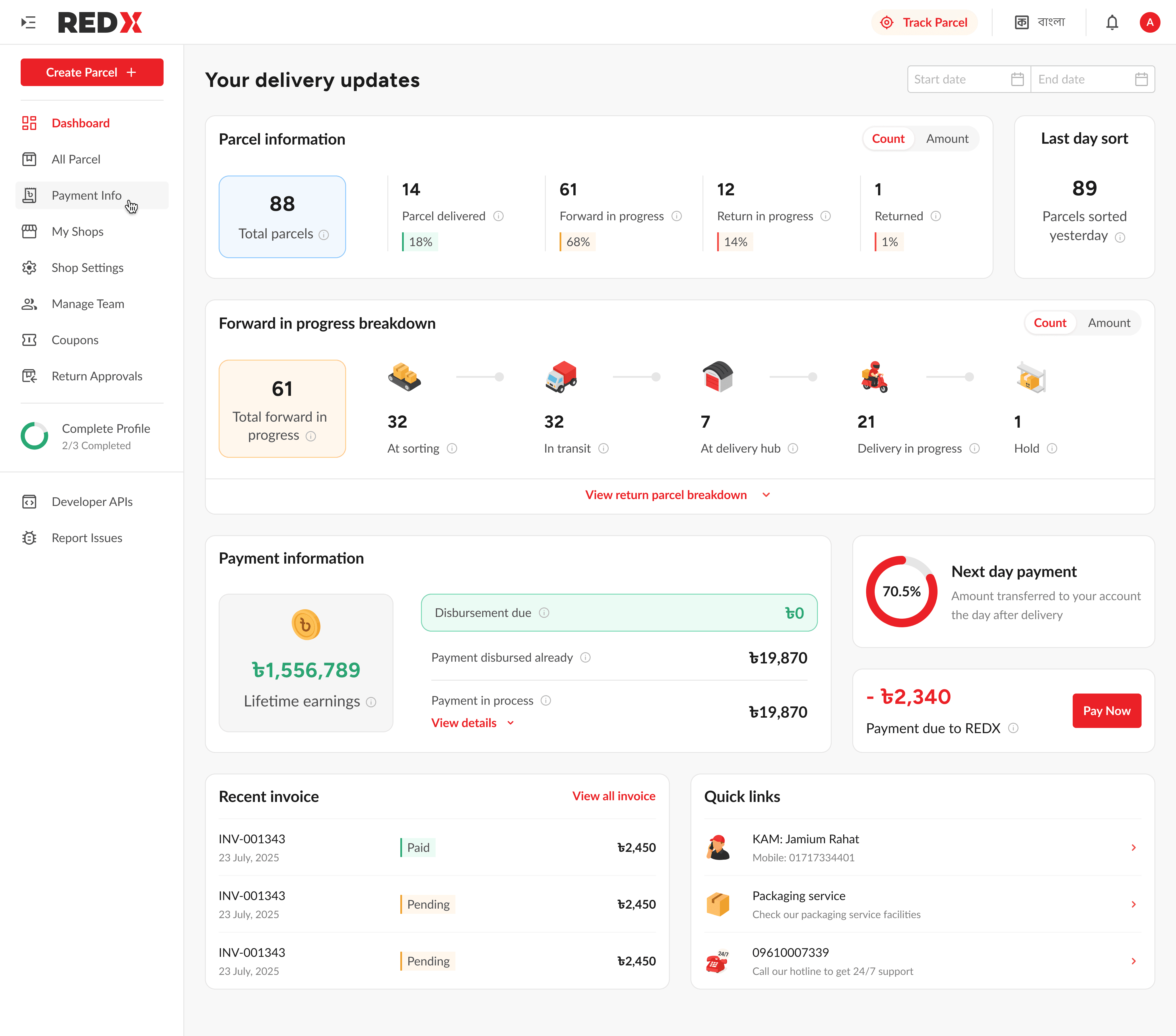
Redesign: Streamlining how merchants track and act on parcels
Parcel info shows totals with a Count vs Amount toggle for clarity.
Each stat block links directly to the parcel or payment list view.
Last day sort surfaces yesterday’s operational volume for quick context.
Forward journey displayed with icons across sorting, transit, hub, and delivery.
Return journey mirrors the flow but stays hidden by default to reduce clutter.
Collapsible sections keep the cockpit light while preserving depth when needed.
Collapsed view: Parcel overview

Redesigned: From hidden balances to clear, actionable payments
Payment info collapses by default but expands to show detailed breakdowns.
Next day payment shown as a progress ring to set payout expectations.
Payment due surfaced as a red card with amount and Pay now action.
Recent invoices previewed with Paid and Pending chips plus a View all link.
Quick links trimmed to essentials like KAM contact, packaging service, and hotline.
Expanded view: Payment breakdown

Redesigned: Full dashboard image
Mobile responsive
Before redesign
Dense layout with mixed content made scanning difficult on small screens.
Hamburger-only navigation hid important tasks behind extra taps.
Quick links and banners took visual weight away from daily operations.
Side nav felt secondary and lacked a sense of central control.
Tracking and payments were harder to locate without clear hierarchy.


Redesigned
Structured layout with card sections improved readability & scan flow.
Bottom dock with four primaries and a central Create parcel action.
Floating Create parcel button added on the dashboard for frequent use.
Side nav redesigned as a full-screen hub for managing shops, team, and settings.
Quick links trimmed and repositioned, keeping focus on core merchant tasks.


Custom icons to add context,
not decoration.
I designed 3D-style icons to show parcel states like in transit or at hub. The goal was to give merchants more context behind numbers instead of generic box symbols. These icons will be refined further based on merchant feedback.

Impact and measurement
Measuring the impact of the redesign
Time to first parcel dropped by 27.6%
Median time from signup to first pickup before vs after launch.
Navigation misclicks reduced by 34%
Measured with Hotjar events and repeated navigation paths.
Invoice views increased by 17.8%
Unique visits to invoice pages per active merchant each week.
On-time dues paid improved by 12%
Compared COD settlement dates against expected cycles.
Support tickets about disbursement down 20%
Ticket volume in payments category over two 30-day windows.
Reflection & next steps
Reflection on what was learned and where
improvements can be made
Research required more time than planned, stretching to a month and limiting design exploration.
The desktop dashboard still carries density, targeted one on one tests could surface simplification opportunities.
Direct interviews and support calls produced the clearest insights, while Hotjar data was less reliable due to shared accounts.
Step-by-step breakdowns gave merchants more value than totals by exposing delivery bottlenecks.
The left rail was consistently praised and created room for future growth.
Early focus skewed toward desktop, which led to some compromises in mobile delivery.
Next steps for evolving the dashboard
and mobile experience
Add product type statistics on the dashboard, leveraging the data merchants already enter at parcel creation.
Redesign the mobile app to align with the new web IA and features, as the existing app is three years outdated.
Surface seasonal and monthly delivery trends to help merchants prepare for volume spikes.
Enable bulk parcel creation in mobile to support high volume merchants on the go.
Maintain a continuous research ledger and extend one on one, phone, and support based studies to inform iteration.
This case study is best viewed on a bigger screen. Switch to a laptop or desktop to see all the details.